
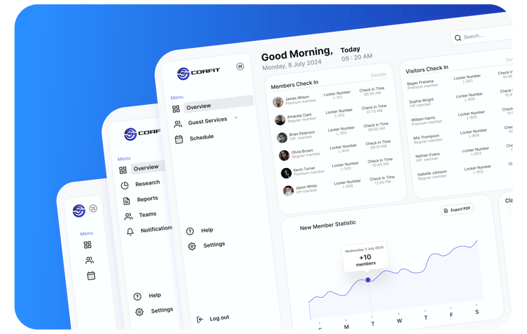
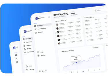
Optimizing Fitness CRM: Creating CoreFit to Enhance Member Engagement and Operational Efficiency


UI/UX Design Bootcamp Learning
Students at Purwadhika Digital Technology School
As a UI/UX Designer, I crafted CoreFit, a CRM (Customer Relationship Management ) platform with intuitive interfaces and seamless workflows to boost member engagement and operational efficiency for fitness businesses. This user-centered design approach significantly enhanced the user experience and streamlined processes.
Context
I created CoreFit’s MVP (Minimum Viable Product) to validate key features like member management and scheduling, enhancing engagement and streamlining operations for fitness businesses. The focus on a user-friendly design and strong data security ensured quick adoption and valuable feedback for future improvements.
Design Process
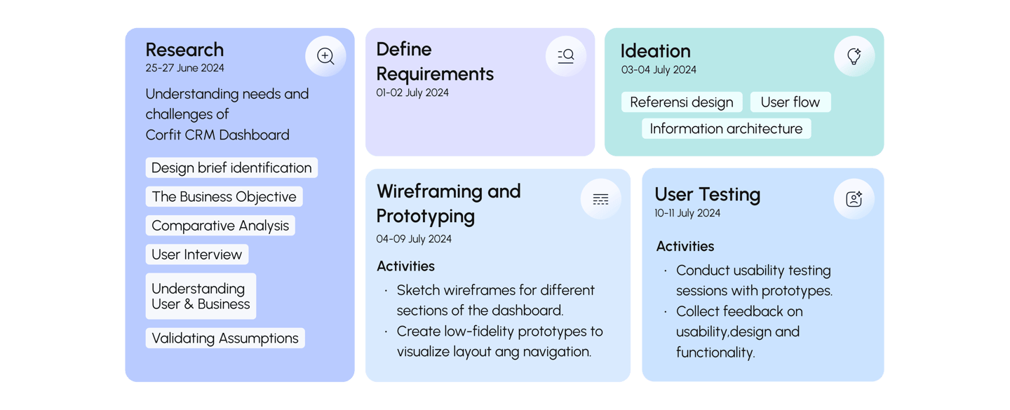
To create a (better product) with good (ux), I used the following design process.
Project Intro
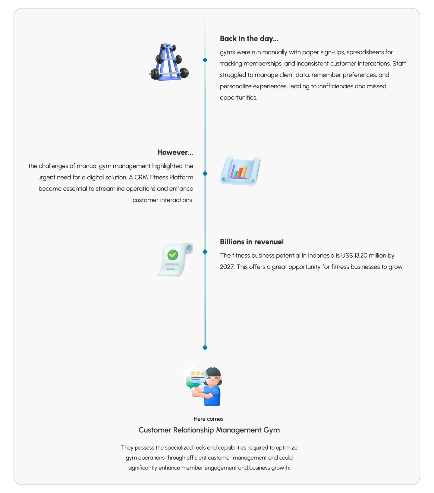
The rising fitness market in Indonesia, driven by increasing health awareness, presents an opportunity to enhance gym operations and member engagement.
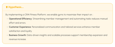
The Business Objective





Comparative Analysis
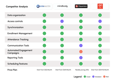
This study aimed to evaluate top industry systems and pinpoint areas where CoreFit CRM can enhance its services by addressing identified gaps and shortcomings.
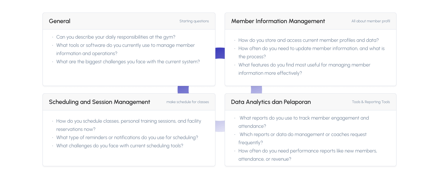
Interview Questions
Validating assumptions in the design helped me ensure the resulting solution truly fit the user's needs. Developing focused interview questions allowed me to gather genuine insights, refine features, and avoid costly mistakes.
Session Overview
The interview session was held with the admin staff at fitness centers, including Fit Hub, Pride Fitness, Celfit, and Emporium Gym.
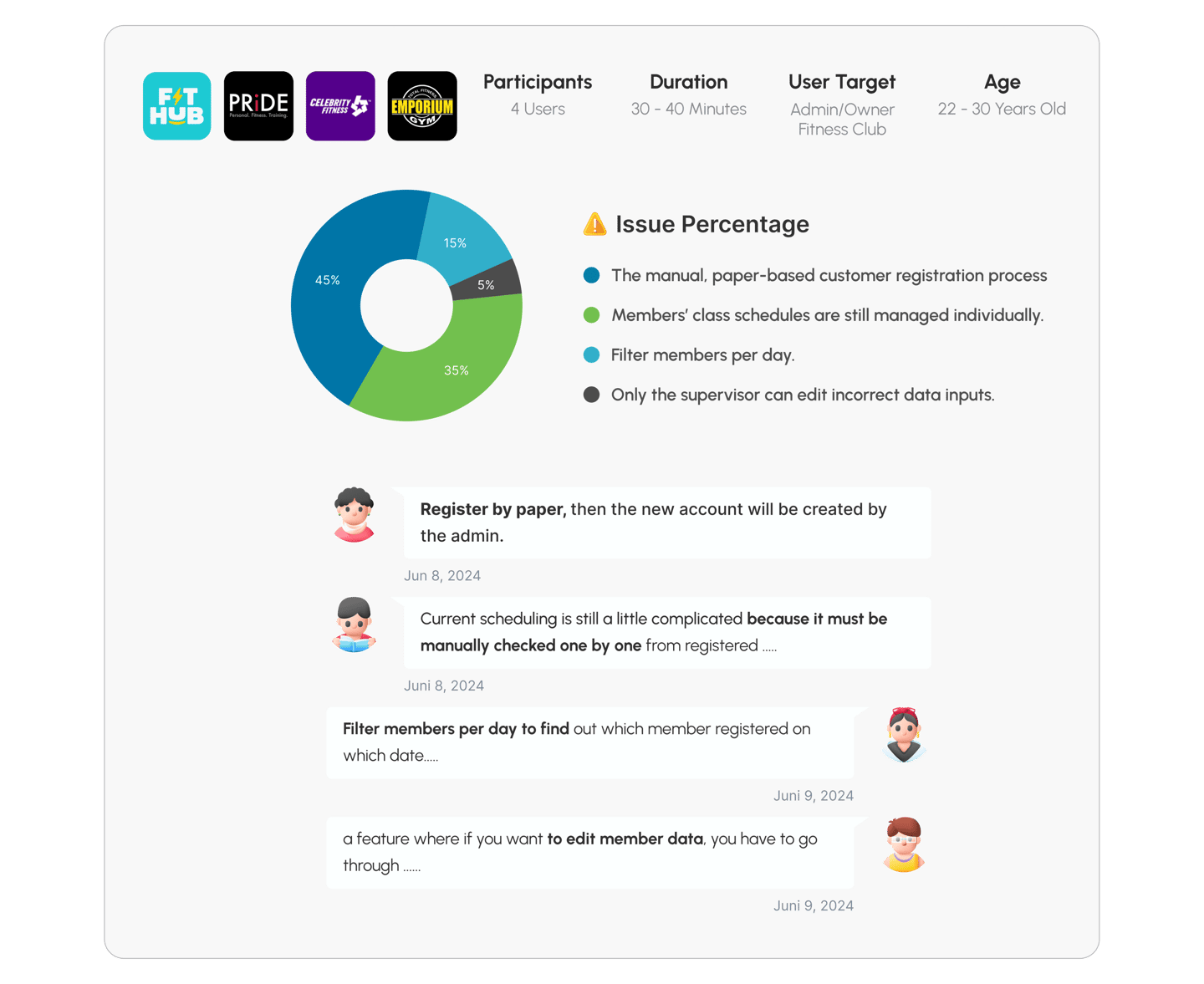
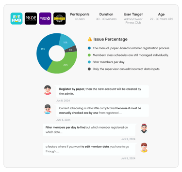
This approach categorizes related feedback, usability issues, and user behaviors to identify patterns that guide design improvements. Grouping similar issues makes the analysis more structured, leading to efficient problem-solving and focused enhancements for a better user experience.
Understanding User
Customer Relationship Management Behaviors
CRM helps fitness club admins and owners understand members, streamline communication, personalize services, and make data-driven decisions, leading to better member satisfaction and business growth.
Understanding Business
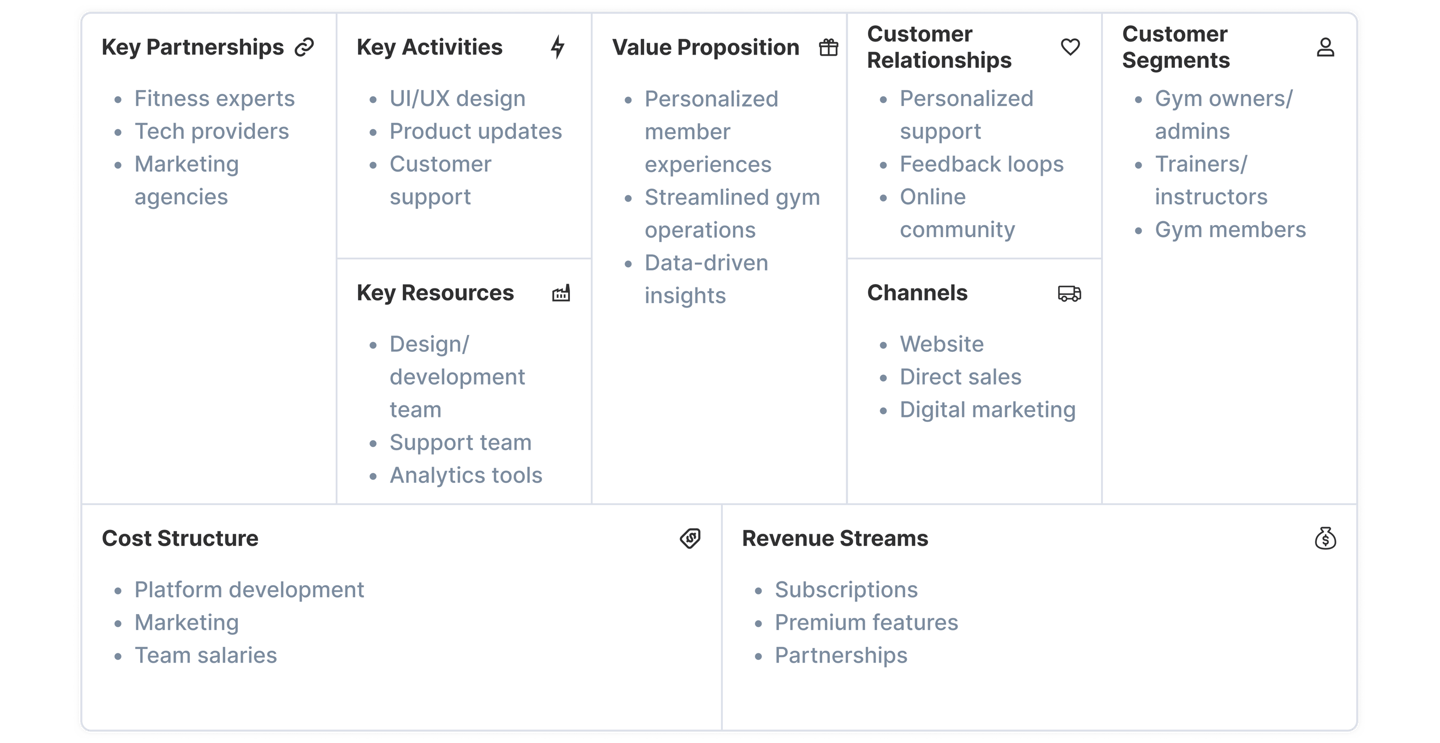
Business Model Canvas
The rising fitness market in Indonesia, driven by increasing health awareness, presents an opportunity to enhance gym operations and member engagement.

Validating Assumptions
Issue Groupings
Research Analysis
About The Product
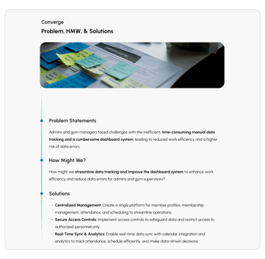
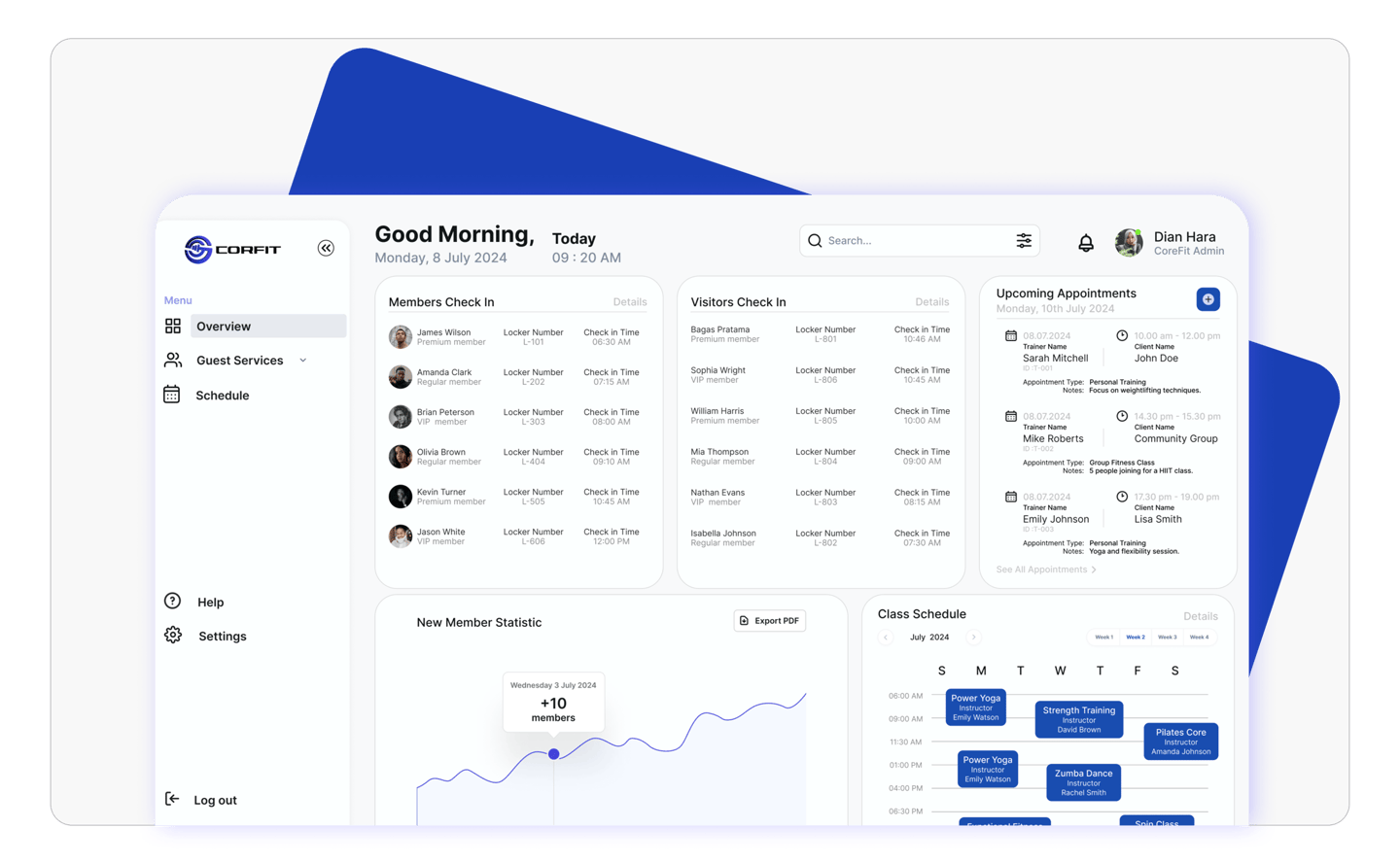
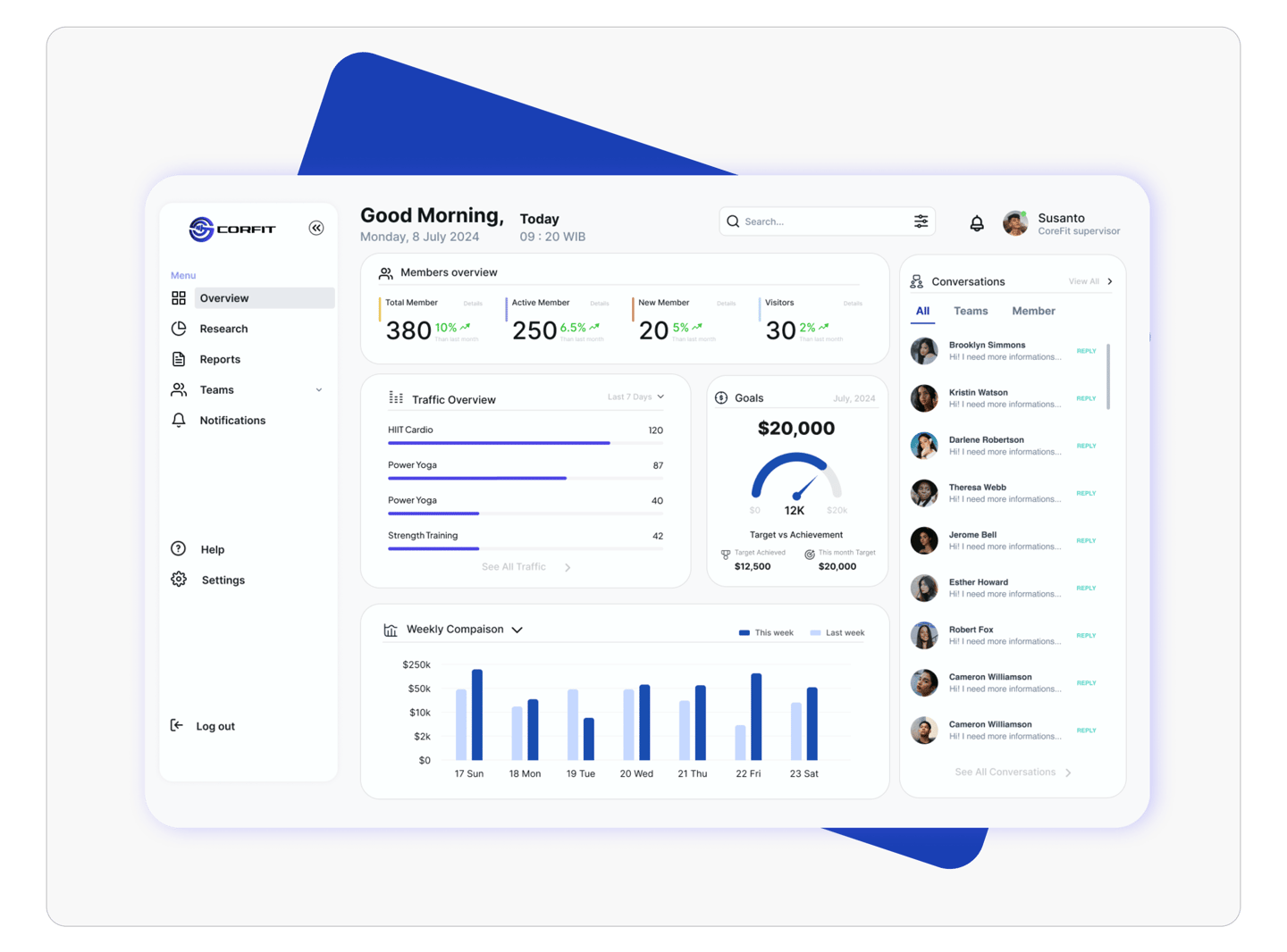
This dashboard provides a clear view of CRM, centralizing member data, tracking attendance, class performance, and revenue for easy staff access. It streamlines operations, improves decision-making, and enhances member satisfaction with faster, more efficient service.


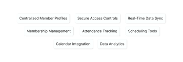
Key features include
User Persona
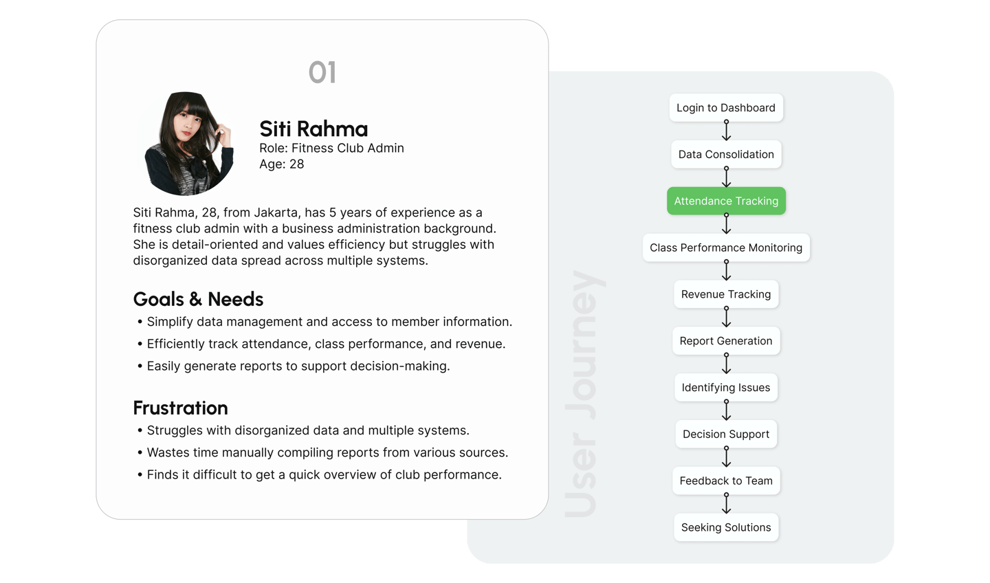
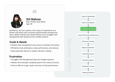
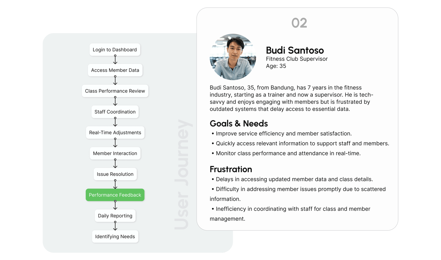
Using fitness club admin and Supervisor personas ensures the CRM design meets the needs of both roles, simplifying data for admins and improving service efficiency for supervisors.
User Flows
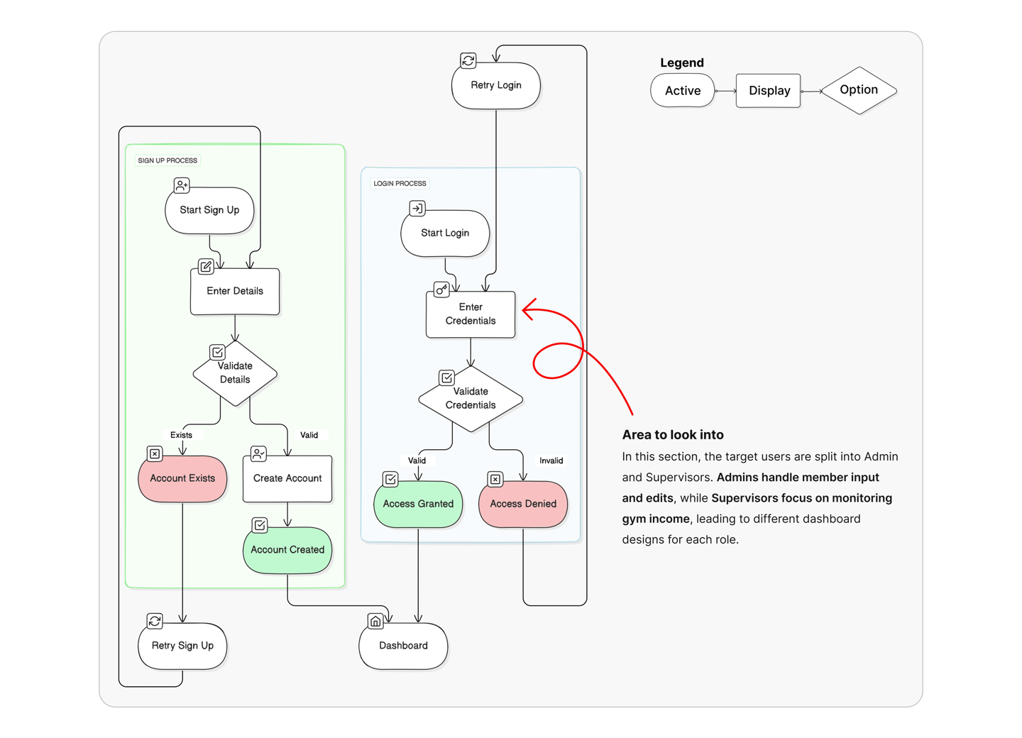
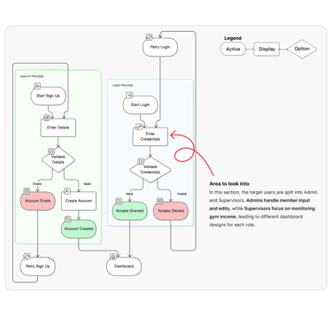
This is the proposed flow to login and connect the target user with the Corfit Dashboard.
This is a proposal for admins to add special appointments to clients with customized sessions with Personal Trainers.
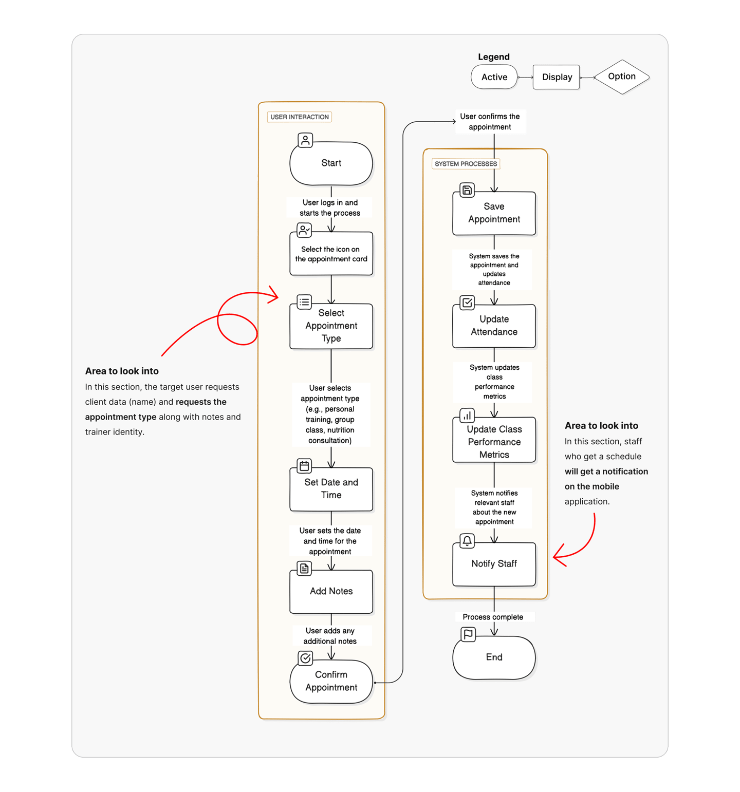
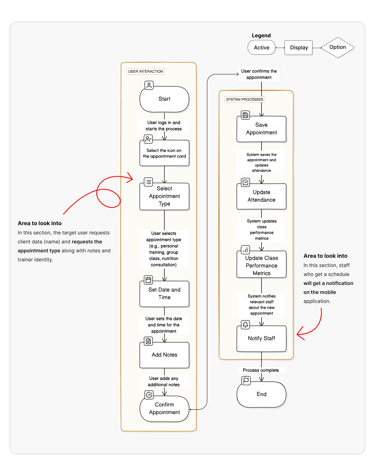
3. Add New Appointment
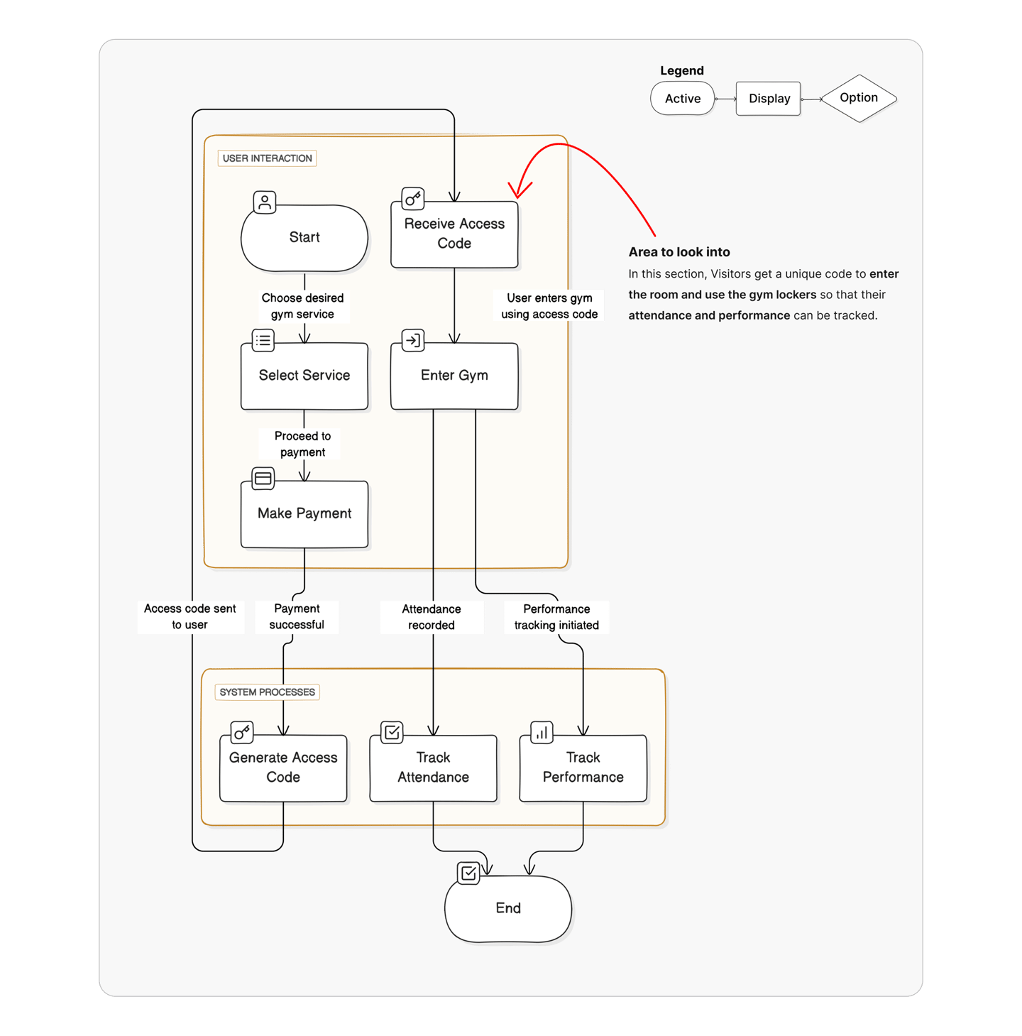
1. Login/Sign up
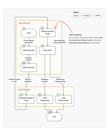
2. Visitors Check In gym access
This is a proposal for admins to Visitors Check In allowing them to access gym services and selecting services.
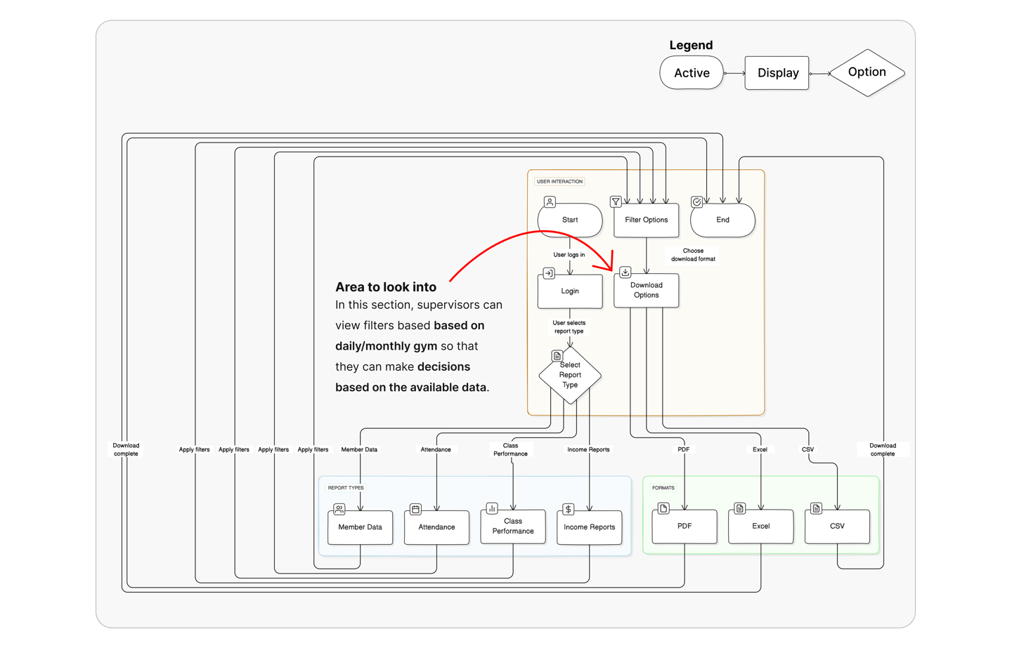
4. Download Report Flow
This is a proposal for supervisors to get a report on the gym's performance in terms of profit, staff performance, and consumer attendance.
Information Architecture
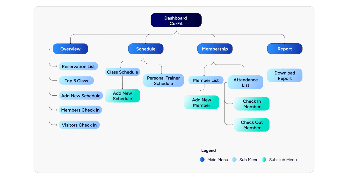
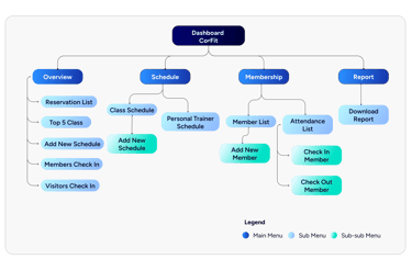
Once I had mapped out the user flows for the four main tasks, I shifted focus to crafting the information architecture, which aimed to streamline and improve the user navigation experience.
Initial Sketches
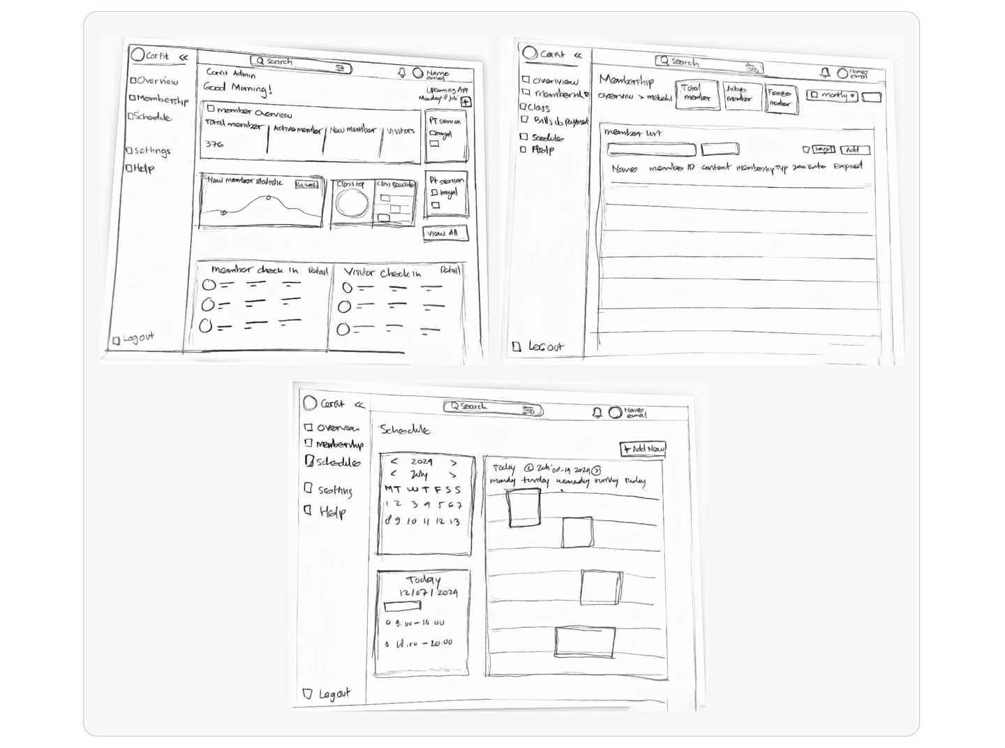
After improving the user flow, I created UI sketches to bring the ideas to life, refining them step by step until the final design for the furniture website was completed.
Design System
A design system ensures consistency, simplifies navigation, and speeds up development, reducing errors and enhancing both staff efficiency and member experience. It also supports future scalability as the system evolves.
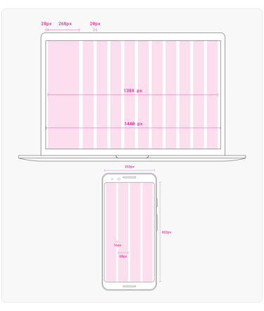
Spacing
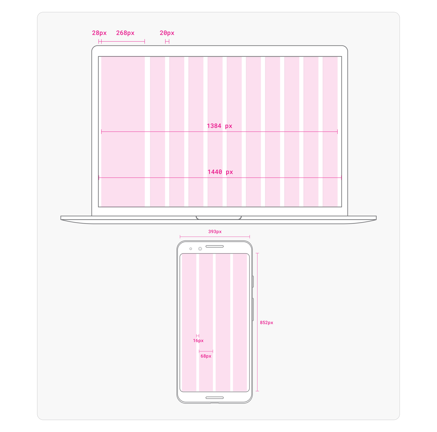
The design is based on a 1440-pixel wide framework, which incorporates a modern 10-column grid system with a 1-column dashboard menu, and for mobile uses 4 columns with 16-pixel margins. This setup creates a clean, well-balanced, and highly flexible structure, ensuring a smooth UI/UX experience.

Grid System
Using good spacing to organize information creates a clear order, makes it easier to read, and improves usability. This helps build a unified and engaging interface, which is key for a solid design system.
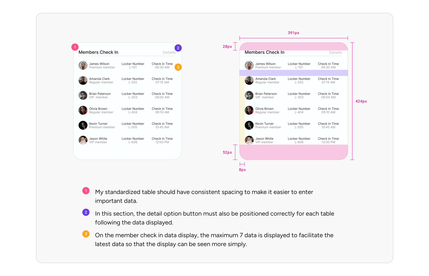
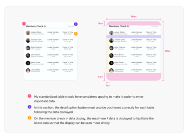
Regular Table Anatomy
The standard table is a key component in page layouts, offering flexibility for customization and integration with other elements. Its adaptability is vital in UI/UX design for clear and organized data presentation.
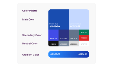
Color Palette
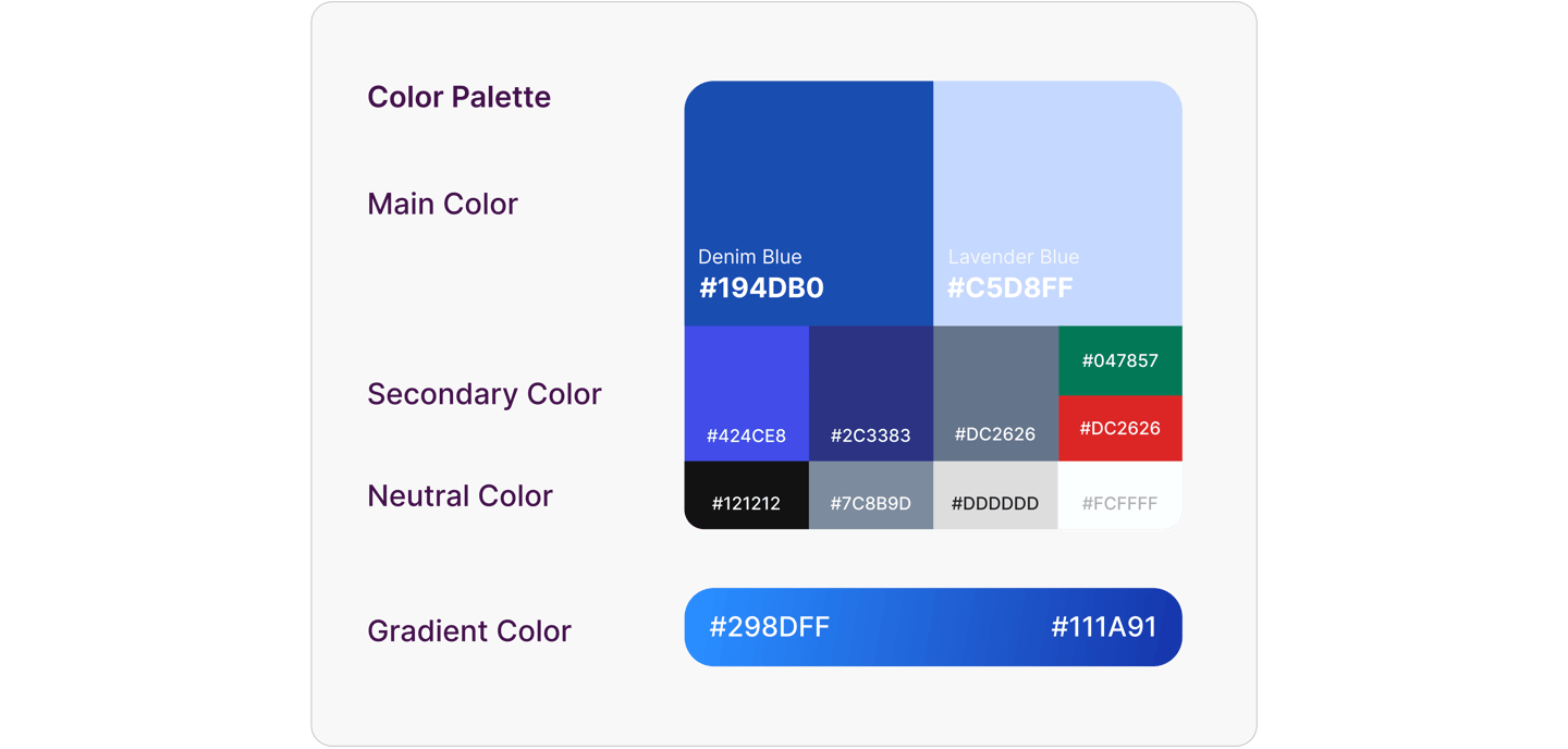
Colors are a core part of a brand’s look, setting the style and mood of UI design. They show the brand’s identity, direct user attention, and highlight important messages, making them essential for a smooth user experience.
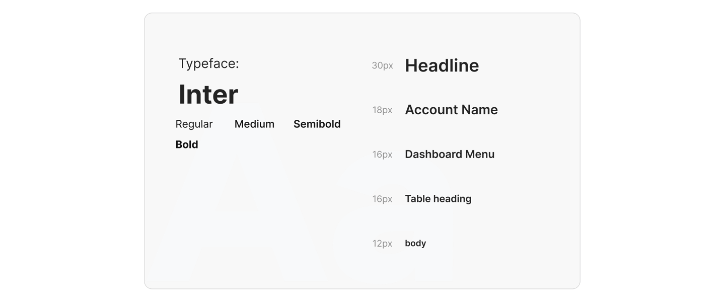
Typography
Typography is an important part of the design system, working with color and shape to express the mood and tone of ConFit Dashboard while strengthening brand identity and enhancing user experience.
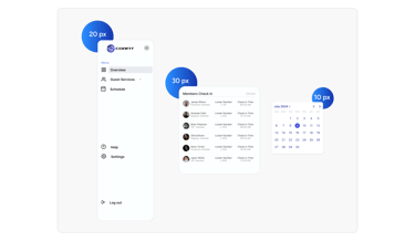
Corner Radius
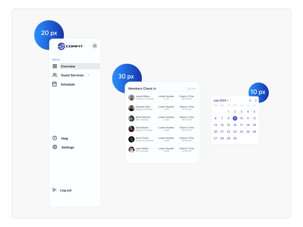
Corner Radius shapes are important in design, and changing the angle can create a different look. These shapes show ideas and help users understand how to use something.
Shadow
A drop shadow is a way to add depth by putting a shadow under an object, making it look like it’s above the surface. This effect makes things stand out, shows their importance, and gives the design a 3D feel.


Master Components
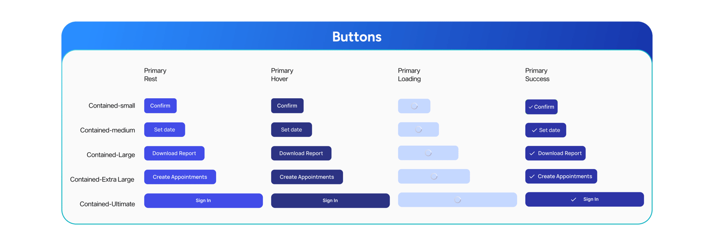
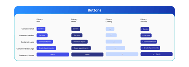
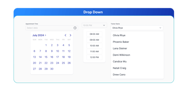
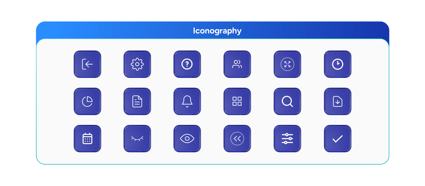
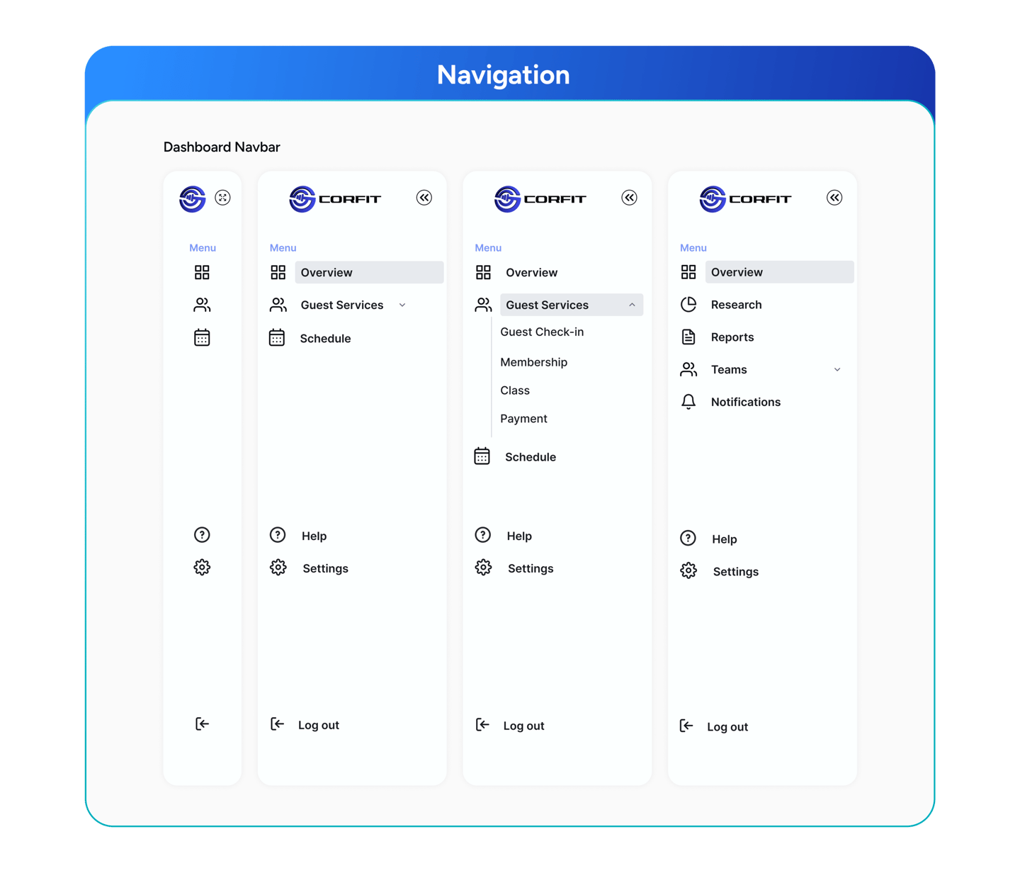
I used Atomic Design on the Dashboard CorFit to make reusable parts that create a uniform and user-friendly interface with built-in accessibility.

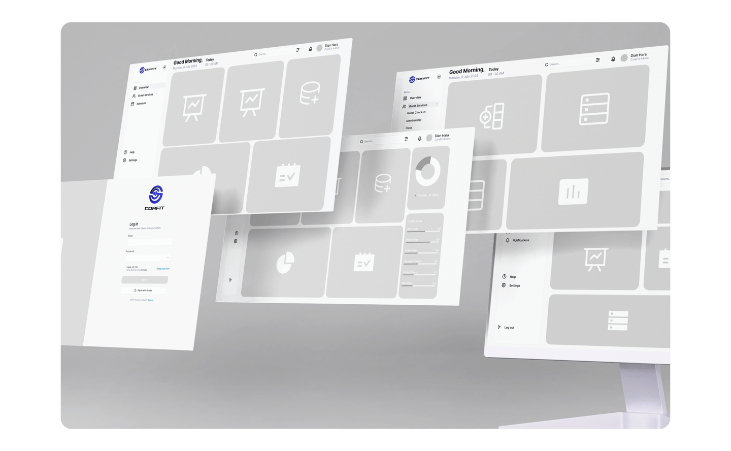
Low Fidelity
I created a low-fidelity prototype to focus on key features and improve the user experience, making sure we stay on track with the overall goal without getting distracted by small details.
Mentoring Design
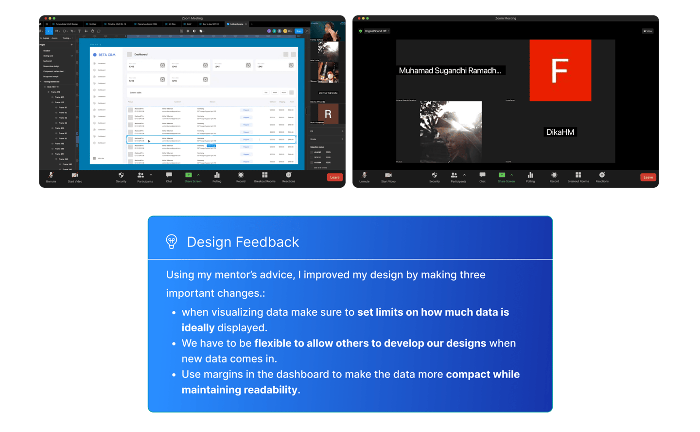
Throughout the design process, I worked closely with Bootcamp mentors during consultation sessions, using their advice to improve the UI/UX design. This helped ensure the design was of high quality and included important feedback.
High Fidelity
Following my mentor’s feedback, I created a detailed design for Dashboard CorFit that fits the look and user experience perfectly.
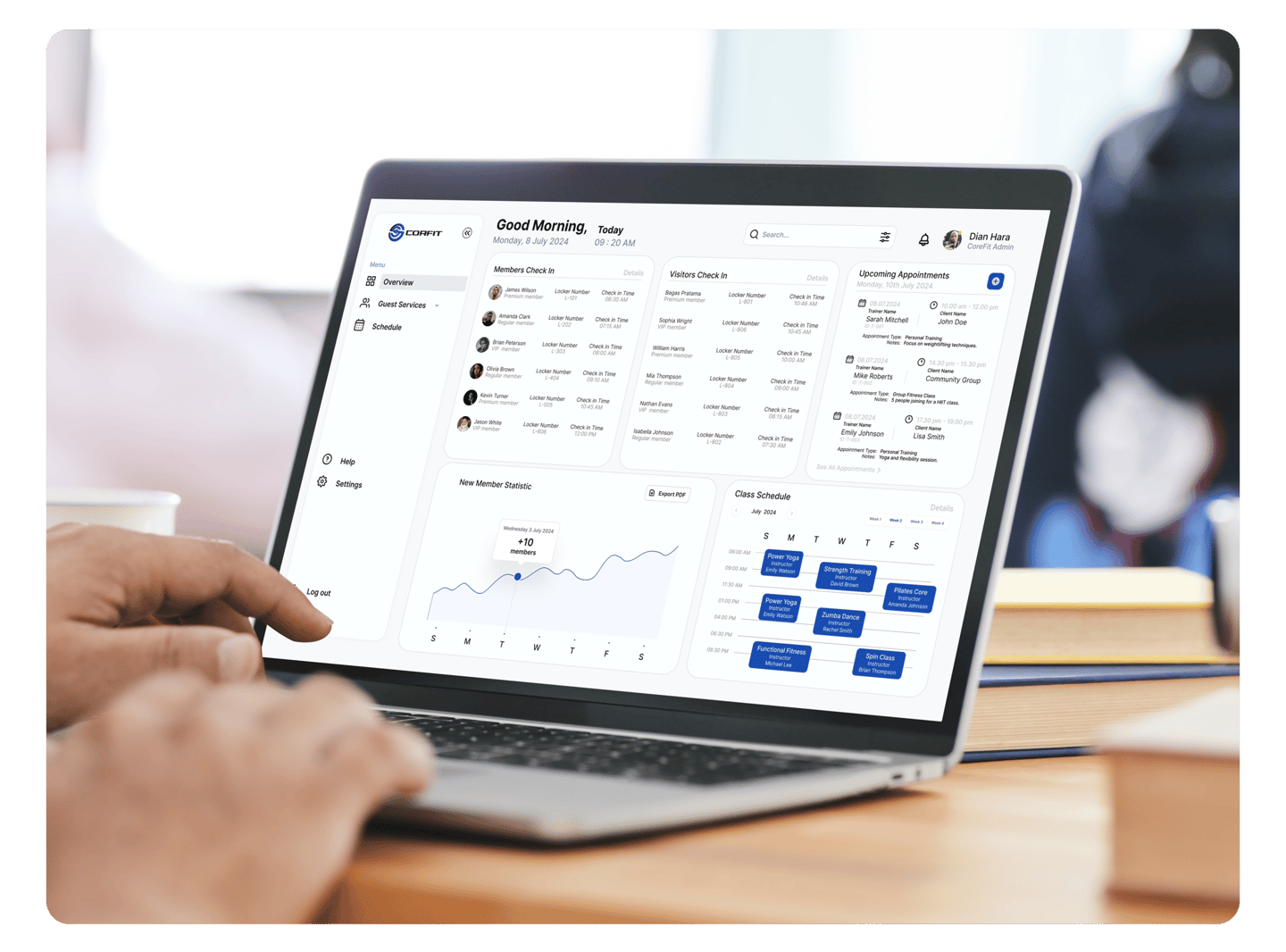
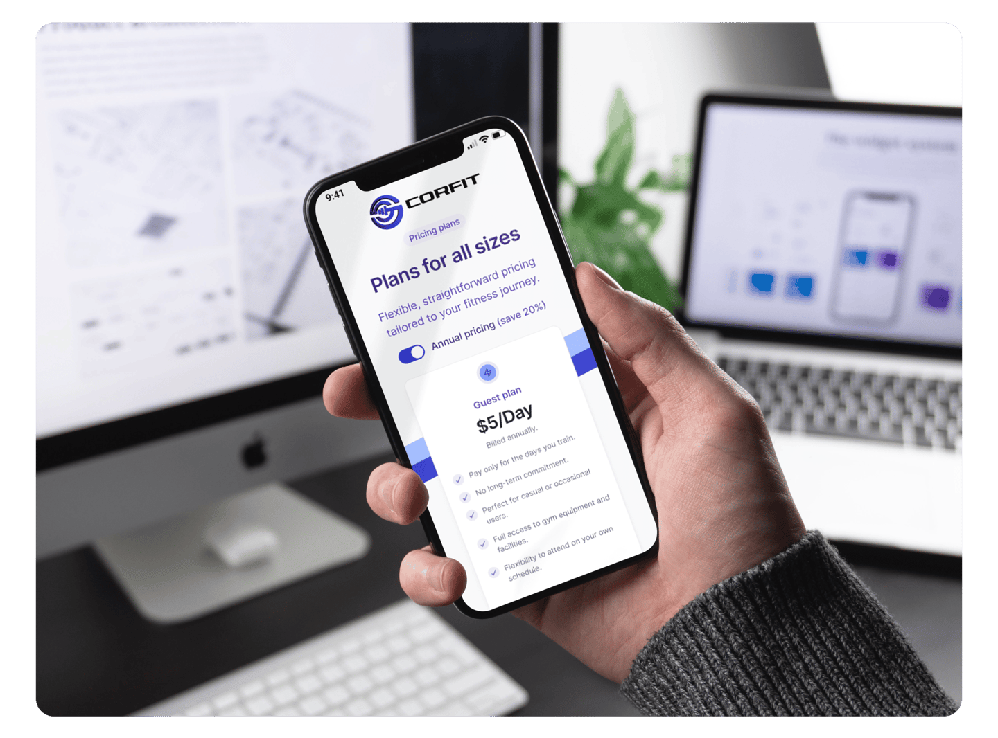
Visual Showcase
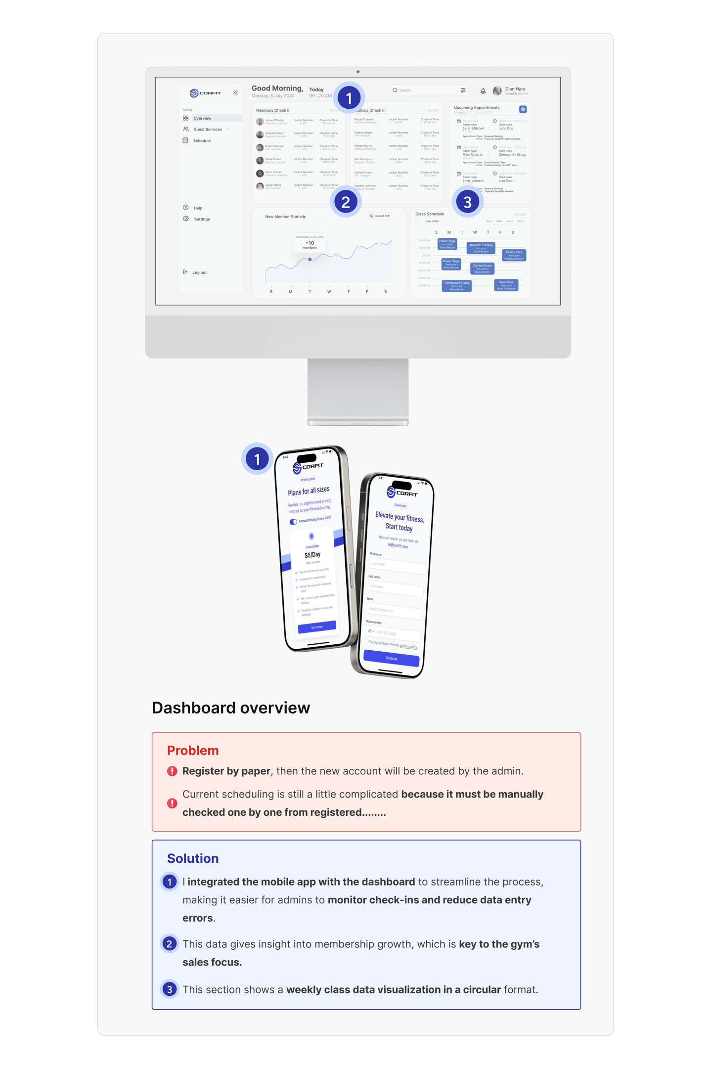
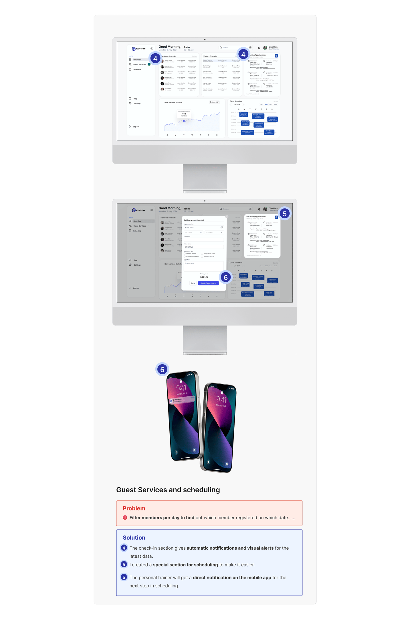
After creating the high-fidelity, I proceeded to design a detailed visual display for the CorFit Dashboard.
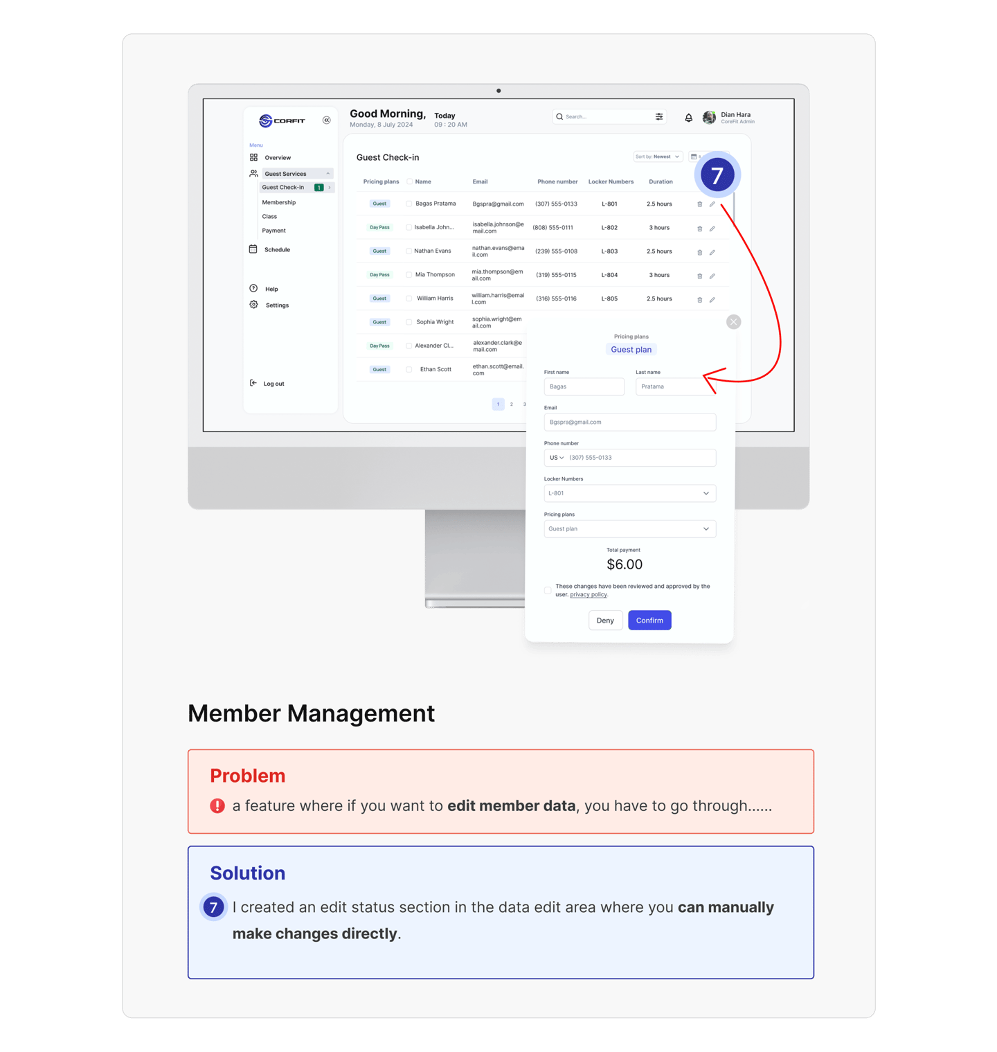
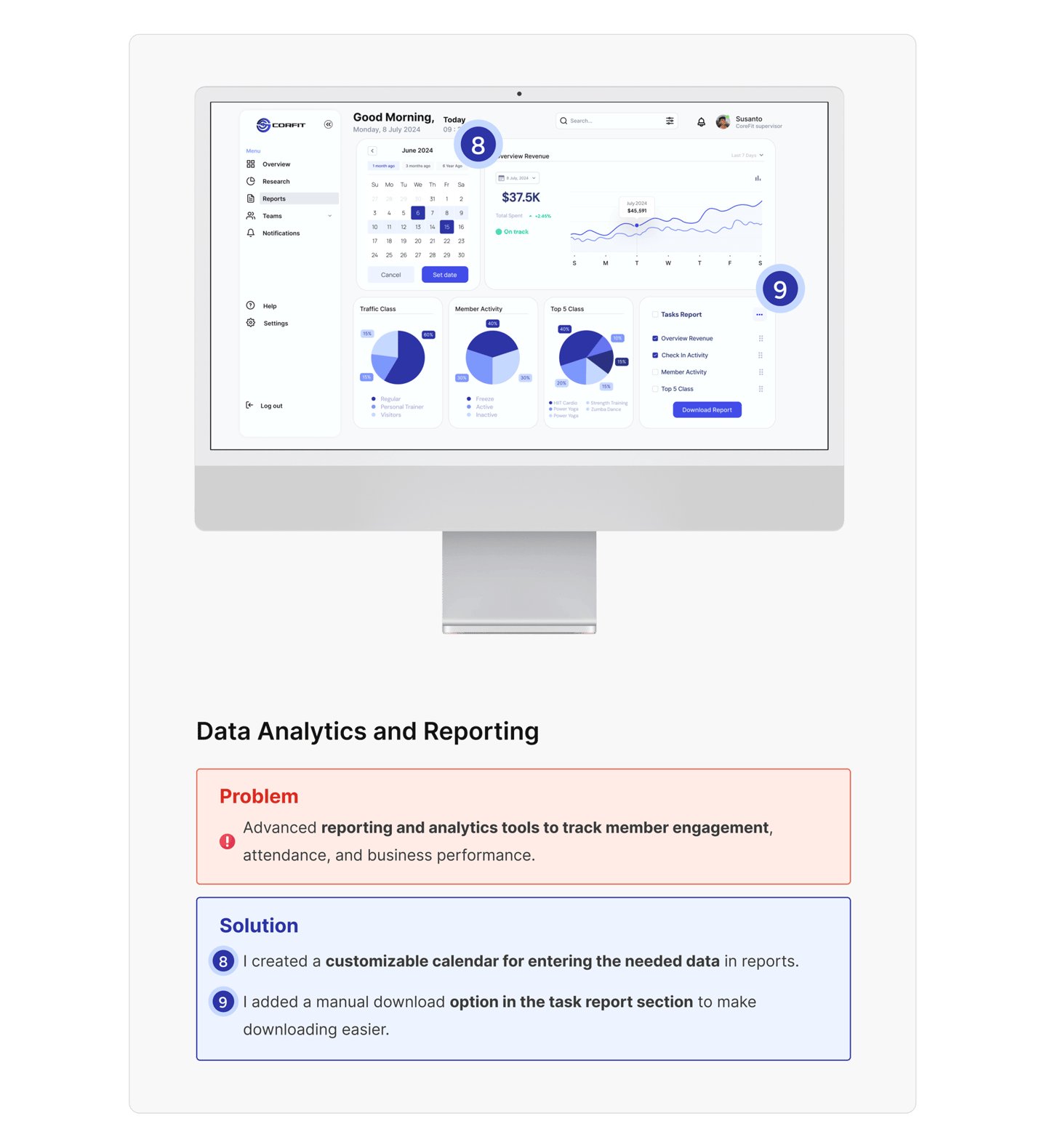
Usability Testing
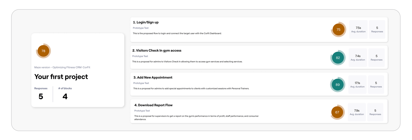
I use Maze to run usability tests and collect feedback, help improve the Corfit dashboard, and here get a test score of 78%, I think this value is good for users to understand the minimum value of this Corfit dashboard.
Usability Findings
The following are the findings of usability testing.


Reviewer Feedback
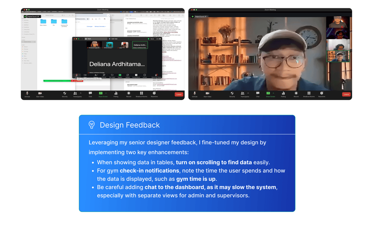
After two weeks of redesigning and testing, the project was shared with the senior designer to check if it meets standards and gives a good user experience.
Prototype
The following is a dashboard prototype from the dashboard over view to the user flow in this study case.
Dashboard CorFit Overview
This video gives a quick overview of the CorFit Dashboard. It centralizes member data, tracks attendance, monitors class performance, and provides revenue insights.

CorFit Dashboard login failed
This video explains the issue of a failed login attempt on the dashboard. It highlights potential causes, such as incorrect credentials or system errors, and offers quick solutions to regain access.

Visitors Check In gym access
This video demonstrates how the dashboard manages visitor check-ins for gym access. It centralizes visitor data, tracks attendance, and provides a smooth and efficient check-in process.

Add New Appointment
This video shows how to add a new appointment using the dashboard. It simplifies the process of scheduling, centralizes member information, and tracks upcoming appointments.

Download Report Flow
This video guides you through the process of downloading reports from the dashboard. It centralizes key data, such as attendance, class performance, and revenue, making it easy for staff to generate and access reports.

Final Takeaways
The key takeaway from this gym dashboard case study is learning how to design while considering the limitations of data visualization, and effectively separating sensitive owner data according to the roles and responsibilities of the target users, such as admin and supervisor.
