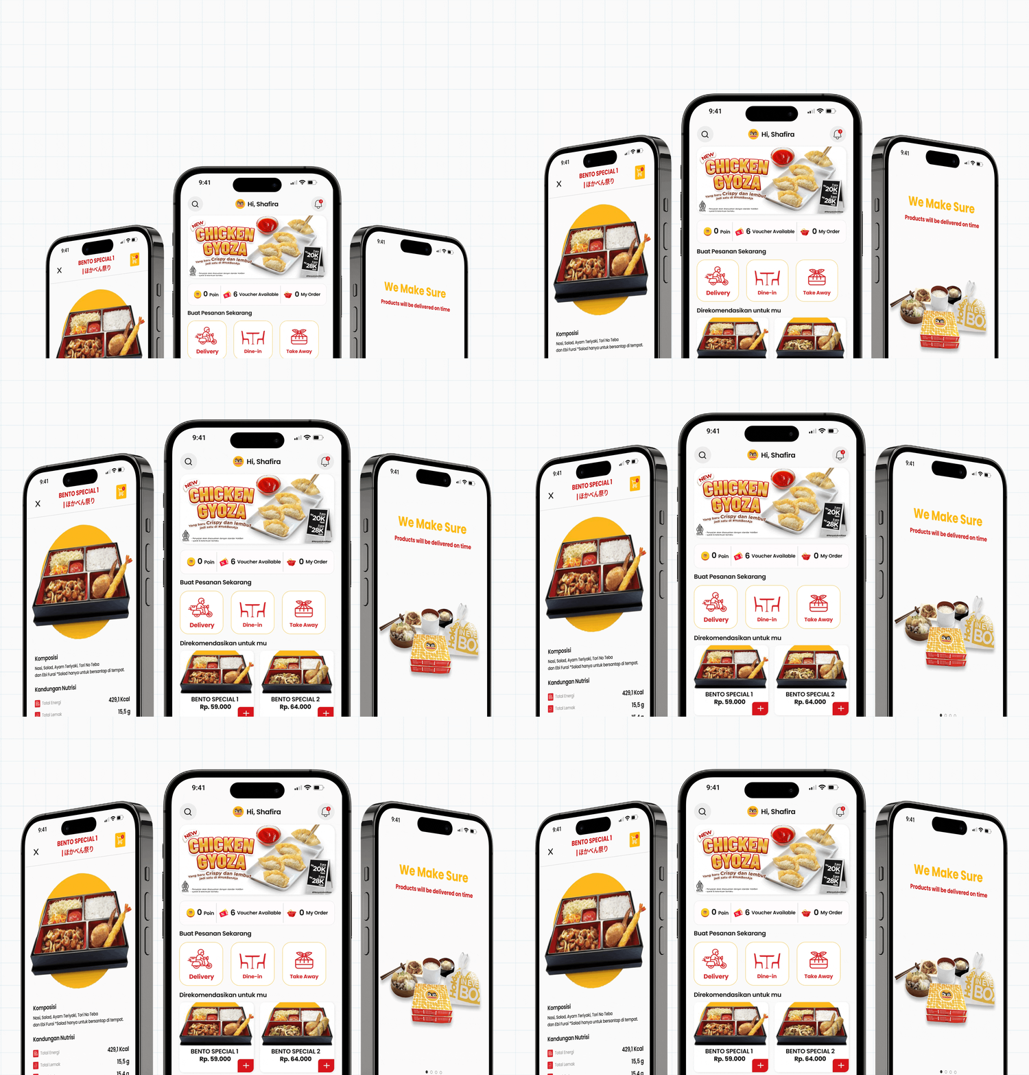
Transforming User Engagement: Redesigning the Voucher & Points

Transforming User Engagement:

Redesigning the Voucher & Points Interface for a More Intuitive App Experience

UI/UX Design Bootcamp Learning

Students at Purwadhika Digital Technology School

As a UI/UX Designer, I research to identify issues in the application, prioritize them for design progression from wireframes to high-fidelity, and conduct User Testing sessions with mentor support, all reviewed by senior designers.

Timeline Project

Strategy

Discovery

Solution

What is it,

HokbenAja ?

Hokben is a fast food restaurant serving japanese style food based in jakarta, Indonesia.

To improve customer experience, Hokben launched the HokBenAja app on August 17, 2016.

Context

The app has struggled with low ratings, showing a need for better user experience. To fix this, focusing on user engagement is essential. Redesigning the voucher and points interface is a key step, as most users prefer these features. This should boost satisfaction, improve ratings, and build customer loyalty.

Users tend to prefer voucher discounts or bundle deals over free shipping offers.

Enhance user engagement by redesigning the voucher and points interface to create a more intuitive and rewarding experience, ultimately increasing customer satisfaction and app ratings.

Goal
Deliverables
  • Introduced a redesigned interface focused on seamless voucher and points redemption.

  • Streamlined the interface to simplify voucher and points access, making the experience more intuitive and user-friendly.

Impact

User satisfaction with the voucher and points interface increased by more than 20%, after improvements were validated in User Testing 2 (UT2).

Design Thinking process:

Using the Design Thinking process is essential because it prioritizes empathy and user-centered solutions, enabling us to create innovative, effective designs that truly meet users’ needs.

Comparative analysis showed that Hokben should develop its voucher and points features among five other F&B apps. This project aims to redesign these interfaces for a more intuitive user experience.

Comparative Analysis Conclusion

To ensure that the redesigned voucher and points interface actually improves the user experience, conducting usability testing on the hokbenAja app directly with users is essential.

Usability Testing 1

Usability testing was conducted on the HokbenAja App prior to the redesign, resulting in a 65% completion rate from a moderate group of 5 users.

Summary Usability Testing 1

These results underscore the need for a redesign, highlighting opportunities for significant improvements in usability and user satisfaction in the vouchers and points section.

User Findings

During the interview, I asked about the findings from usability testing to develop intuitive, impactful solutions that resonate with the audience.

Affinity Mapping

In the affinity mapping session, I worked with Aufa, Devina, Steven, and our mentor Ka Fanisa to analyze insights from Usability Testing 1 and identify key improvement areas.

Users feel that the visual design of the voucher does not explain the function of the voucher recommended by Hokben.

Users do not understand the function of the points because there is no detailed explanation in the unattractive interface design.

Complex ordering flow because all menus do not appear simultaneously, making it difficult for users to order food.

The ‘How Might We’ method is the next step, it turns challenges into opportunities for innovative user-centred solutions.

How Might We

After the HMW stage, I crafted a problem statement to guide our design, ensuring the solutions are intuitive and user-centered.

Problem Statement

“Users struggle with unclear voucher functions, an unappealing interface that lacks explanation for points, and a complex ordering flow that makes food selection difficult.”

Priority Matrix

Based on the ‘How Might We’ findings, I created a priority matrix to identify low-effort, high-impact actions that can be implemented immediately, ensuring limited resources are focused on the most critical issues.

User Persona

User personas are essential to ensure the HokbenAja app’s design aligns with the needs and behaviors of the target audience.

User Flow

I mapped the HokbenAja app’s pre-redesign user flow to identify areas for simplification and improvement.

Initial Sketches

After refining the user flow, I created UI sketches to visualize concepts and iterate before finalizing the detailed designs.

Design System

After finalizing the concept, I created the design system focused on consistency, usability, and aesthetics. This system provides a unified framework of reusable components and guidelines, streamlining the design and development process.

Spacing

The HokbenAja app uses a consistent spacing system based on tokens. I apply the same scale to both the spaces within components and the spaces around the screen edges. The base value is 4px, and I use multiples of this base to create a set of spacing options. These tokens help me align everything neatly on a 4px grid when designing for mobile.

When design elements are placed close together, people naturally see them as connected. If we increase the space between these elements, that sense of connection fades.

Empty space, or white space, is crucial in design because it separates different sections on the screen. This helps create a clear visual order, making it easier to understand the information and focus on key elements.

Elements with more space around them often stand out as more important. To draw attention to key content, give it plenty of surrounding space.

Connection
Hierarchy
White Space
Colors & Themes

The colors in the HokbenAja app are inspired by the Hokben logo, with yellow being the dominant color used as the background and red for the typography. Yellow is a cheerful color that appeals to children and aligns with the Hokben mascot. However, it represents all ages, not just children.

This structure allows us to maintain consistency while also giving us the flexibility to create new themes for future apps.

The HokbenAja App’s primary color system includes two main themes: yellow and red, each with lighter versions. These colors are also adapted for different uses, like fills, borders, and icons, to suit specific design needs.

Typography
Shadow

In the HokbenAja app, surfaces that block the light source create shadows. The light source is always imagined to be directly above the device screen.

Master Components

In the HokbenAja App, using Brad Frost’s Atomic Design, I create reusable components that work together to build familiar, consistent patterns and easy-to-use interfaces. Each component is designed with its own interactions, UI needs, state changes, and variations, all with built-in accessibility.

Low Fidelity

I created a low-fidelity design to focus on core functionality and user experience without getting lost in details.

Mentoring Design

Throughout the design process, I collaborated with Bootcamp mentors in consultation sessions to refine and enhance the UI/UX design, ensuring it met high standards and incorporated valuable feedback.

High Fidelity

Guided by my mentor’s feedback, I crafted a high-fidelity design for HokbenAja Apps, precisely reflecting the final product’s look and feel.

Design Comparison

After finalizing the high-fidelity design, I compared the UI of HokbenAja Apps before and after the enhancements.

Usability Testing 2

To evaluate the design improvements, I conducted a second usability test, revealing measurable insights and addressing issues with voucher clarity, interface attractiveness, and order flow complexity, using the Maze tool.

The second usability test showed a 91% success rate, an increase of 26% from the initial 65%. This improvement confirms the success of my case study in redesigning the Voucher & Points interface for a more intuitive app experience.

Screen to check

Here’s a heatmap analysis of user interactions within the Maze Report feature.

The analysis shows frequent misclicks due to a wide click area, emphasizing the need for a clearer design to reduce CTA errors.

Reviewer Feedback

After two weeks of redesign and a second usability test, the project was presented to senior designer. The purpose was to assess and ensure that the design meets the required standards.

Design Iterate

After receiving feedback from senior designers, I iterated on the design to Enhancing Usability and Improving Aesthetics.

Prototype

Here’s the iterated prototype, resolving issues with unclear vouchers, unattractive displays, missing points explanation, and a complicated order flow.

Outcomes

All two initiatives were executed over two weeks during Usability Testing 1 & 2, leading to the following outcomes:

Final Takeaways

By understanding the preferences and behaviors of users, I can strategically redesign the voucher and points interface to create a more intuitive experience. This approach not only enhances user engagement but also increases satisfaction, ultimately leading to higher app ratings and stronger customer loyalty.