


Optimizing the Return Experience: A Strategic UX Approach to Customer Retention


UI/UX Design Bootcamp Learning
Students at Purwadhika Digital Technology School
As a UI/UX Designer, I designed an easy returns feature aimed at increasing customer retention for Dekoruma, a website platform specializing in furniture. By focusing on streamlining the returns process, we sought to enhance the customer experience and leverage existing buying behaviors. This initiative led to a measurable increase in customer retention rates.
Context
With 57.6% of global internet users making weekly online purchases and Indonesia ranking 6th with 62.6% of users shopping online weekly, competition in the e-commerce space is fierce. The furniture sector alone is projected to generate $387.7 billion in revenue, making customer retention a key focus area. Given that easy return policies influence 30.4% of online shoppers, we recognized the strategic importance of integrating this feature to boost customer loyalty.


Problem
Despite the high volume of transactions, customer retention was identified as an area in need of improvement. Analysis revealed that while existing customers had a 60-70% probability of making repeat purchases, the complex and time-consuming return process was a significant deterrent.
Goal
Improve customer retention by implementing an easy return feature, enhancing user satisfaction, and driving repeat purchases.
Success metrics
1. Retention Rate: Increased percentage of repeat customers.
2. Return Process Time: Reduced average time to complete a return.
3. Customer Satisfaction: Positive feedback and reduced complaints related to returns.
Final solutions
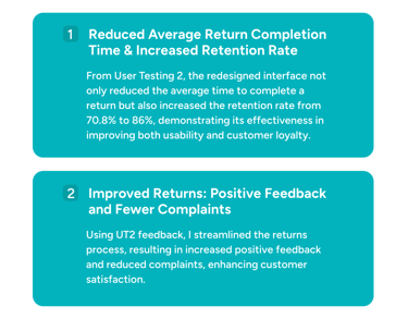
The tested growth experiment tools successfully improved the return experience by over 10% during the second round of user testing 2.
What is it, Dekoruma ?
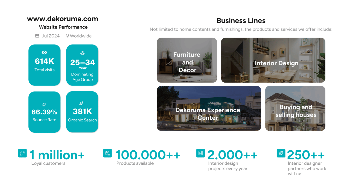
Dekoruma is a B2C e-commerce startup specializing in furniture and interior furnishings. It connects consumers directly with various brands through a marketplace platform, with products provided by the brand owners rather than produced in-house.
Design Thinking Process:
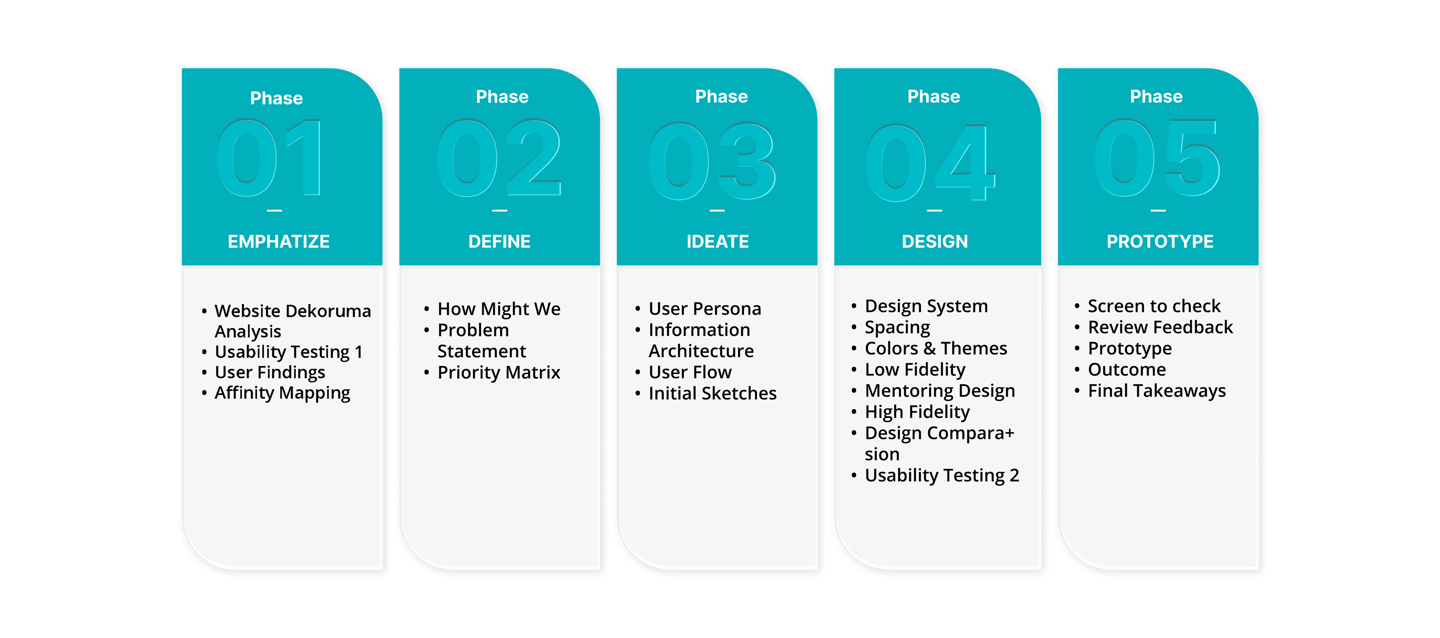
UI/UX design is embraced for its ability to prioritize user needs, fostering creativity and innovation through an iterative process. By focusing on empathy, problem definition, ideation, prototyping, and testing, it ensures that the final product is not only user-centered but also functional and engaging.

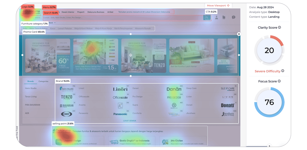
Header website Dekoruma
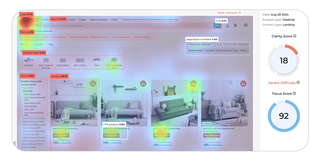
In the website’s navigation header, the Attention Insight tool reveals low engagement scores, with the search bar at just 0.4%, CTA buttons at 0.2%, and the menu bar at 0.7%. These low values contribute to user difficulties in navigating the site effectively.
Dekoruma products Card
The heatmap shows that while the product card grabs 18.1% attention, the product category (5.2%), menu navigation (3.0%), and product CTA (3.0%) lag behind, highlighting a need for better user guidance.
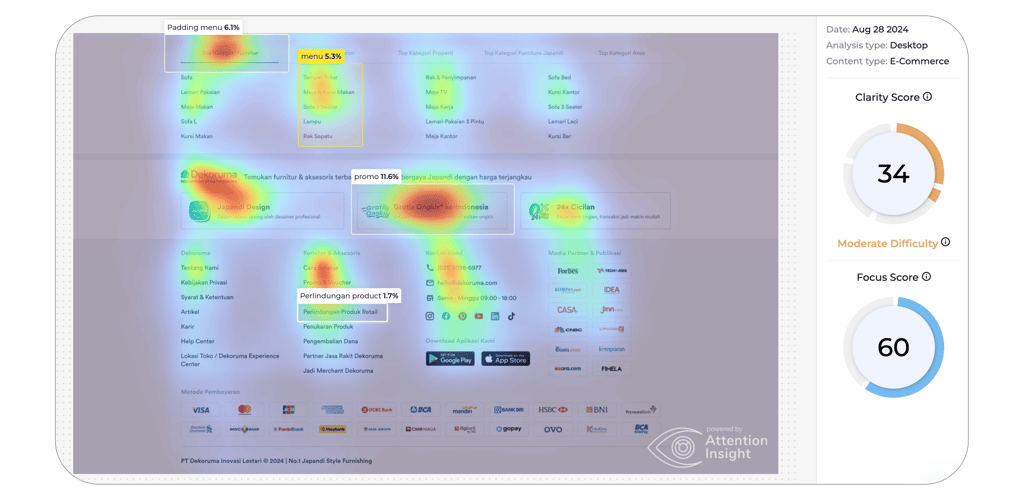
Dekoruma website footer
The promo section leads with 11.6% attention, while the padding menu (6.1%), product menu (5.3%), and product protection CTA (1.7%) need better optimization.
Return policy display
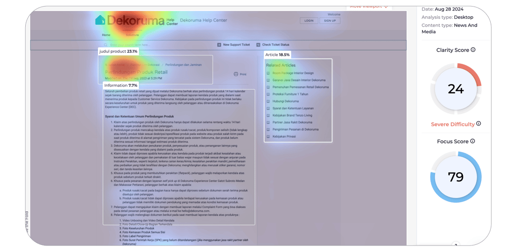
The product protection section’s 7.7% heatmap value indicates the need for improvements to better convey its 18 terms and 7 key points to users.
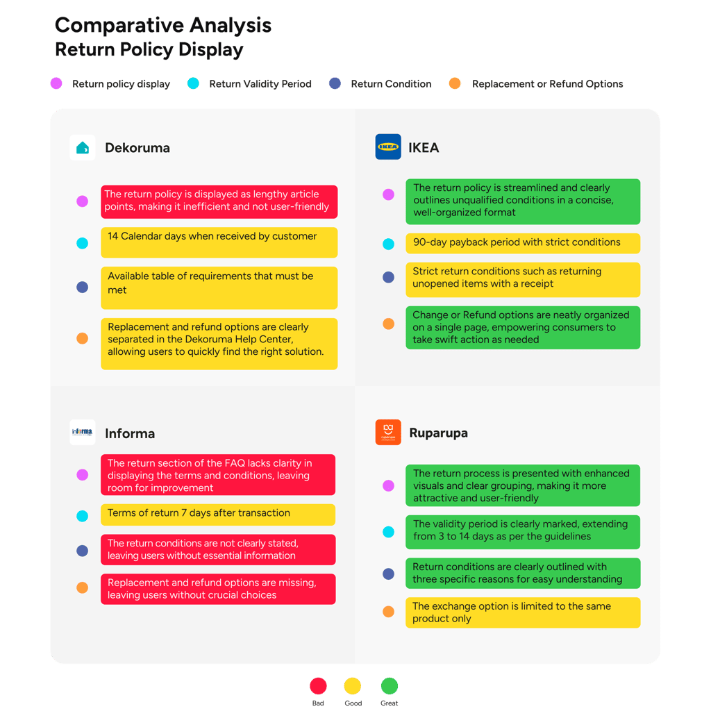
Comparative Analysis Conclusion
Based on the comparative analysis of the Dekoruma website, enhancing the return policy display to consolidate all required documents is essential.
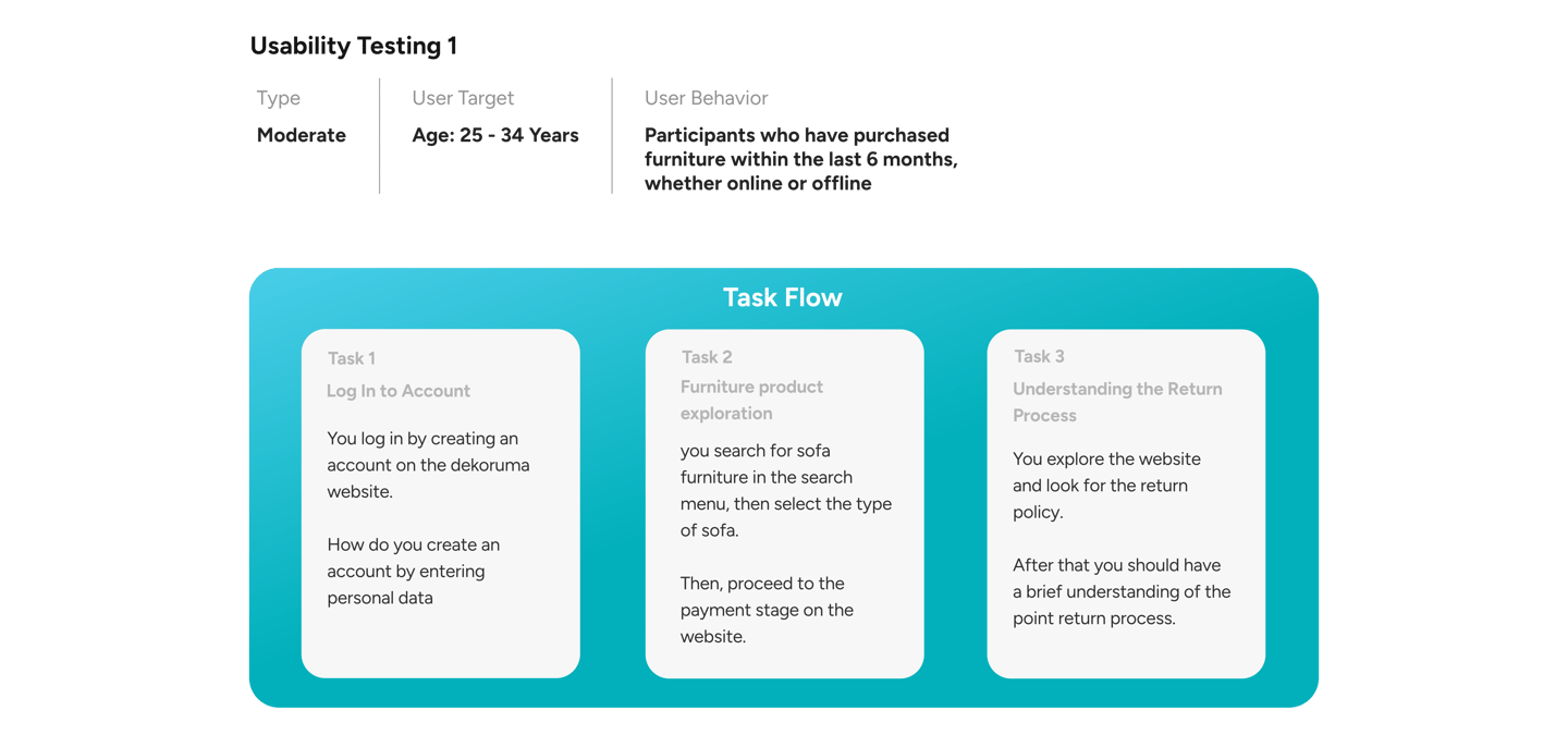
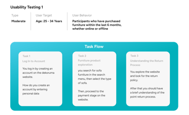
Summary Usability Testing 1
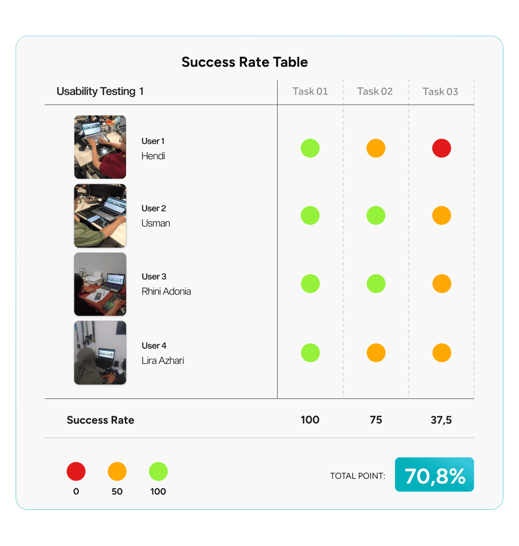
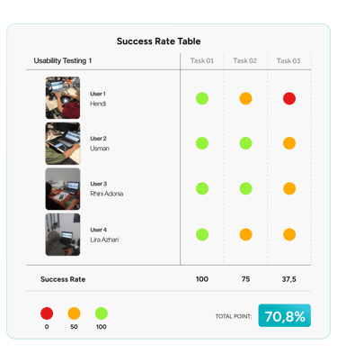
Usability testing on the Dekoruma website showed a 70.8% completion rate from 4 users, emphasizing the need for redesign, particularly to improve Task 3 and clarify the return process.
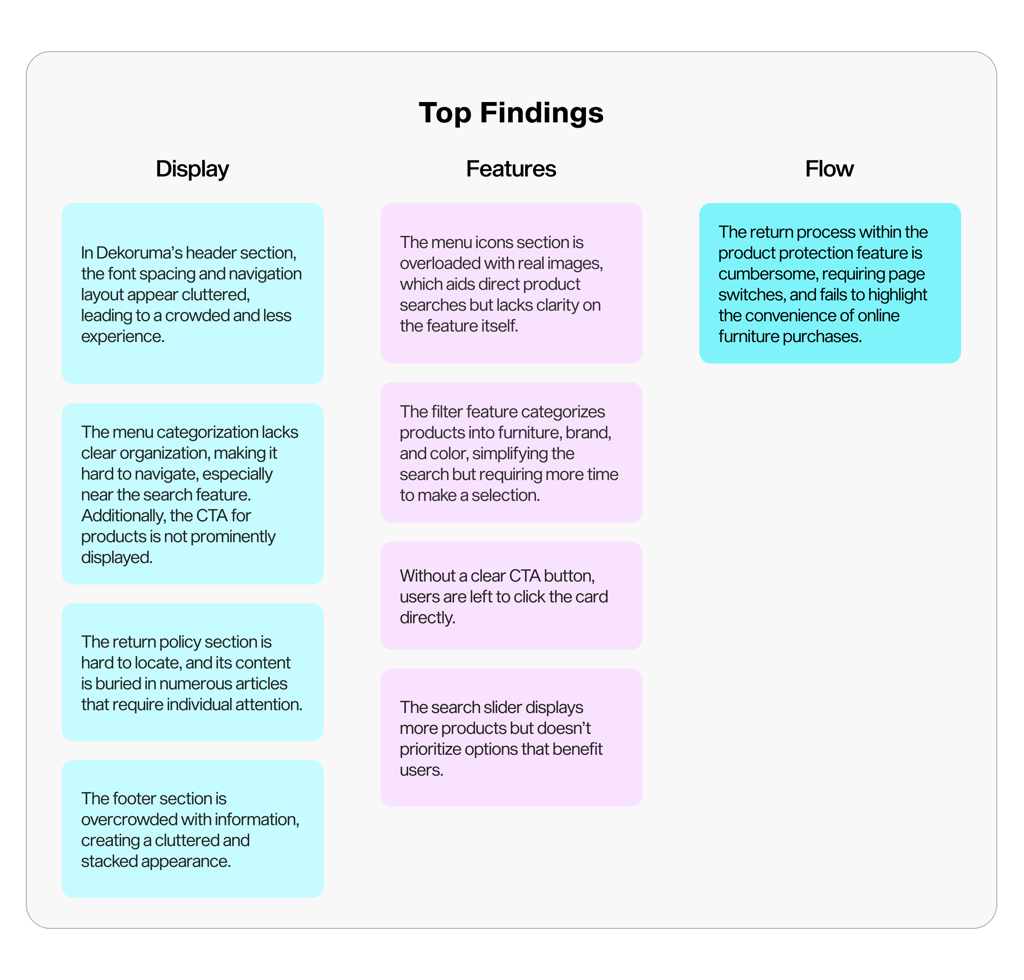
After determining the improvements, a comparative analysis of competitors such as IKEA, Informa, and Ruparupa will help avoid their mistakes and improve the return policy of the goods that are being returned.
Usability Testing 1

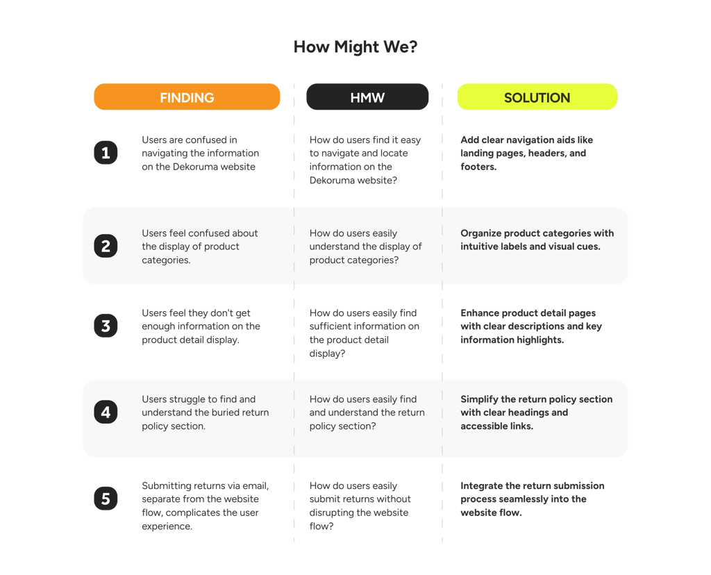
Problem Statement
Following the HMW stage, I developed a problem statement to steer our design efforts, ensuring the solutions are intuitive and focused on the user.
Users struggle with navigating Dekoruma’s website, especially finding product details and understanding returns, affecting their experience and retention. Improving these areas is essential.
Priority Matrix
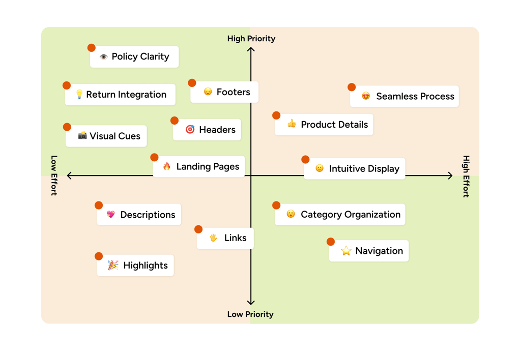
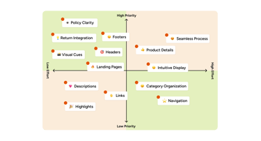
Drawing from the ‘How Might We’ insights, I developed a priority matrix to pinpoint low-effort, high-impact actions that can be quickly implemented, ensuring that limited resources target the most pressing issues.

Defining Persona & Goals
Consolidating our key insights into two goal-oriented personas, we ensure a design approach that deeply resonates with user needs and drives targeted outcomes, setting the foundation for a more intuitive and impactful user experience.
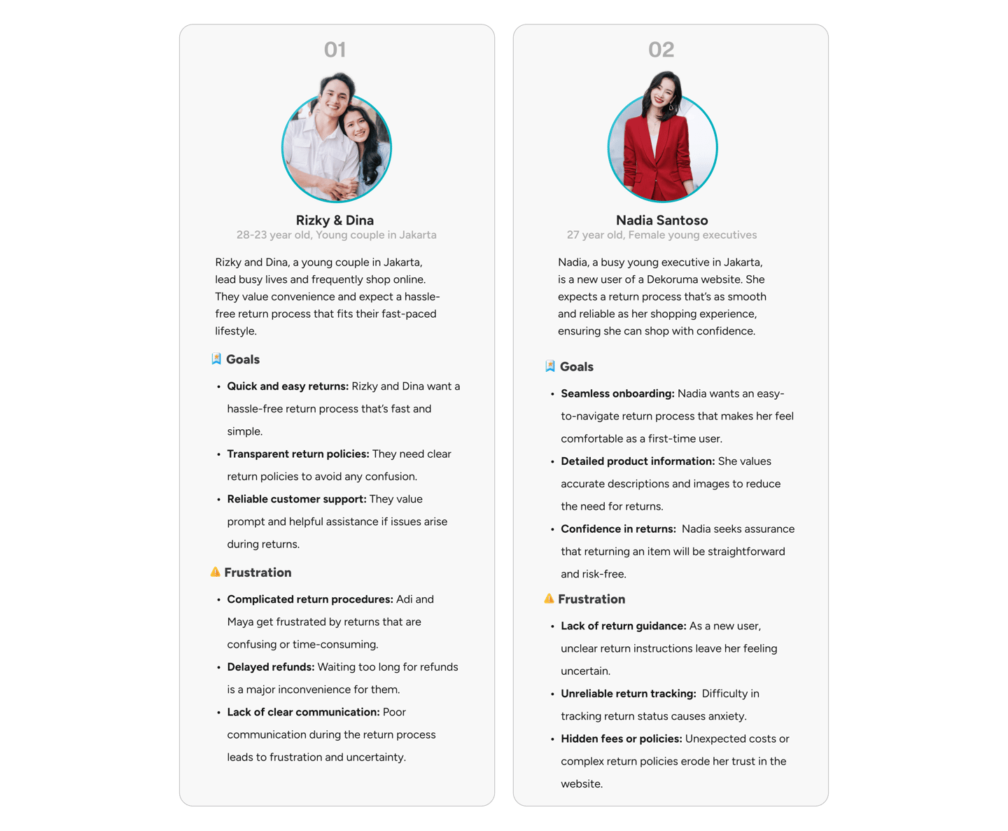
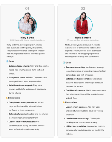
To effectively represent Dekoruma’s diverse user base, I developed two distinct user personas, capturing the unique needs and behaviors of their key audience.
User Flow
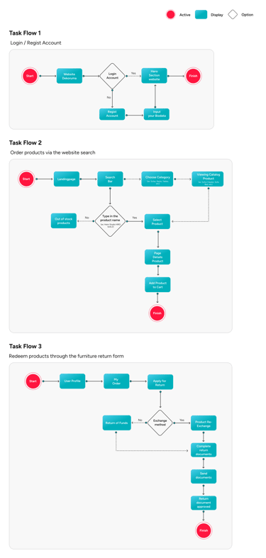
I analyzed the pre-redesign user flow of Dekoruma’s furniture return process to pinpoint opportunities for streamlining and enhancing the overall experience.

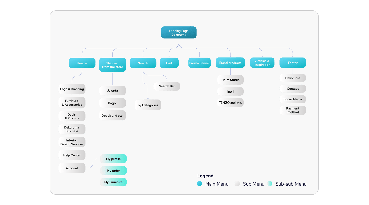
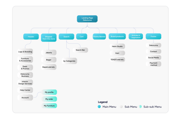
Information Architecture
Following the refinement of the user flow, I developed UI sketches to bring the concepts to life and iteratively enhance them before completing the final design details for the furniture website.
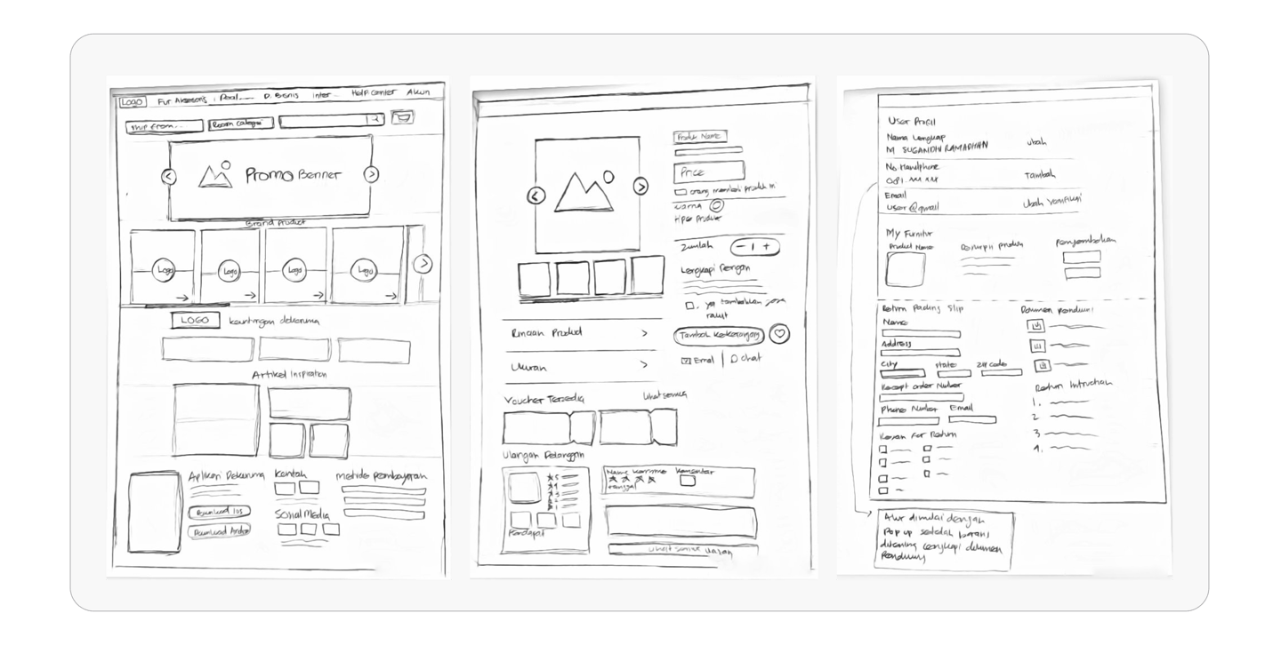
Initial Sketches
After mapping out the user flow for three tasks, I moved on to designing the information architecture to enhance user navigation.

Design System
After refining the concept, I developed a design system that prioritizes consistency, usability, and visual appeal. This system offers a cohesive framework of reusable components and clear guidelines, making the design and development process more efficient and seamless.


Grid System
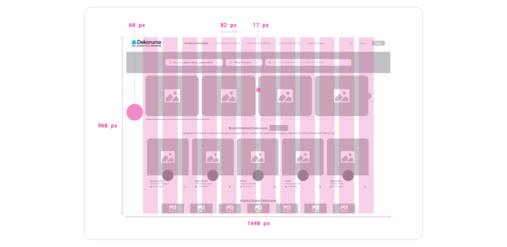
The layout utilizes a 1440 x 960 pixel framework, featuring a sleek 12-column grid system with 25-pixel gutters and 68 pixel margins, ensuring a clean, balanced, and highly adaptable design structure for a seamless UI/UX experience.
Spacing
Structuring information with well-managed spacing creates visual hierarchy, enhances readability, and improves usability, contributing to a cohesive and engaging interface—an essential aspect of any strong design system.

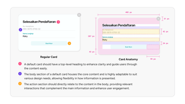
Regular Card Anatomy
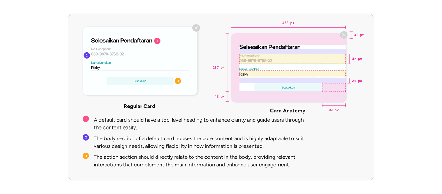
The standard card serves as the go-to component for page layouts, offering versatility to be customized and combined with other components to meet specific design requirements, making it a flexible staple in any design system.
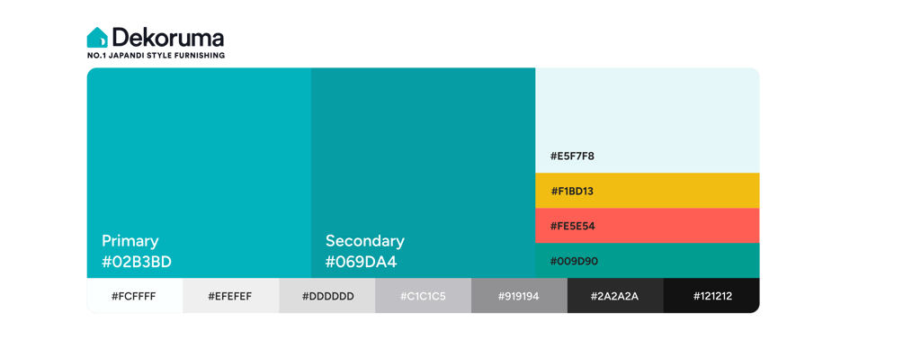
Color Palette
Colors are the visual essence of a brand, shaping the aesthetic and emotional tone of UI design. They reflect brand identity, guide user focus, and amplify key messages, making them vital to a cohesive user experience.

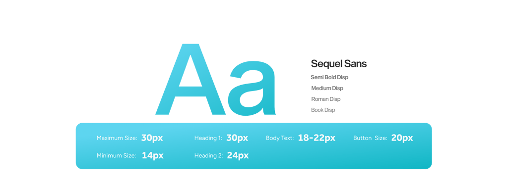
Typography
Typography is a key element of a design system’s visual language, complementing color and form to communicate the Dekoruma brand’s mood and tone. By carefully choosing fonts, sizes, and styles, typography goes beyond text, reinforcing brand identity and enhancing user experience across digital interfaces.
Corner Radius
Shapes are key in design, with adjustable corners to create different visual effects. They represent concepts and guide how users interact with components.


Shadow
Drop shadow is a visual effect that adds depth by creating a shadow beneath an object, making it appear elevated above the surface. This technique highlights elements, establishes visual hierarchy, and enhances the 3D feel of the design.


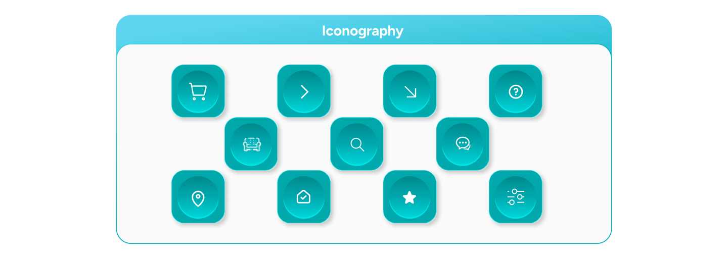
Master Components
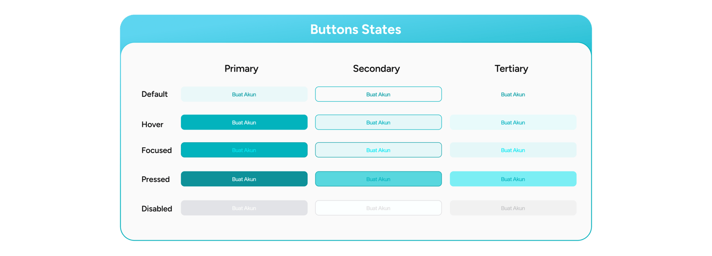
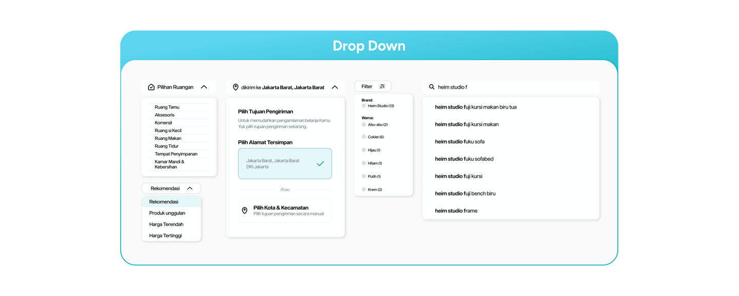
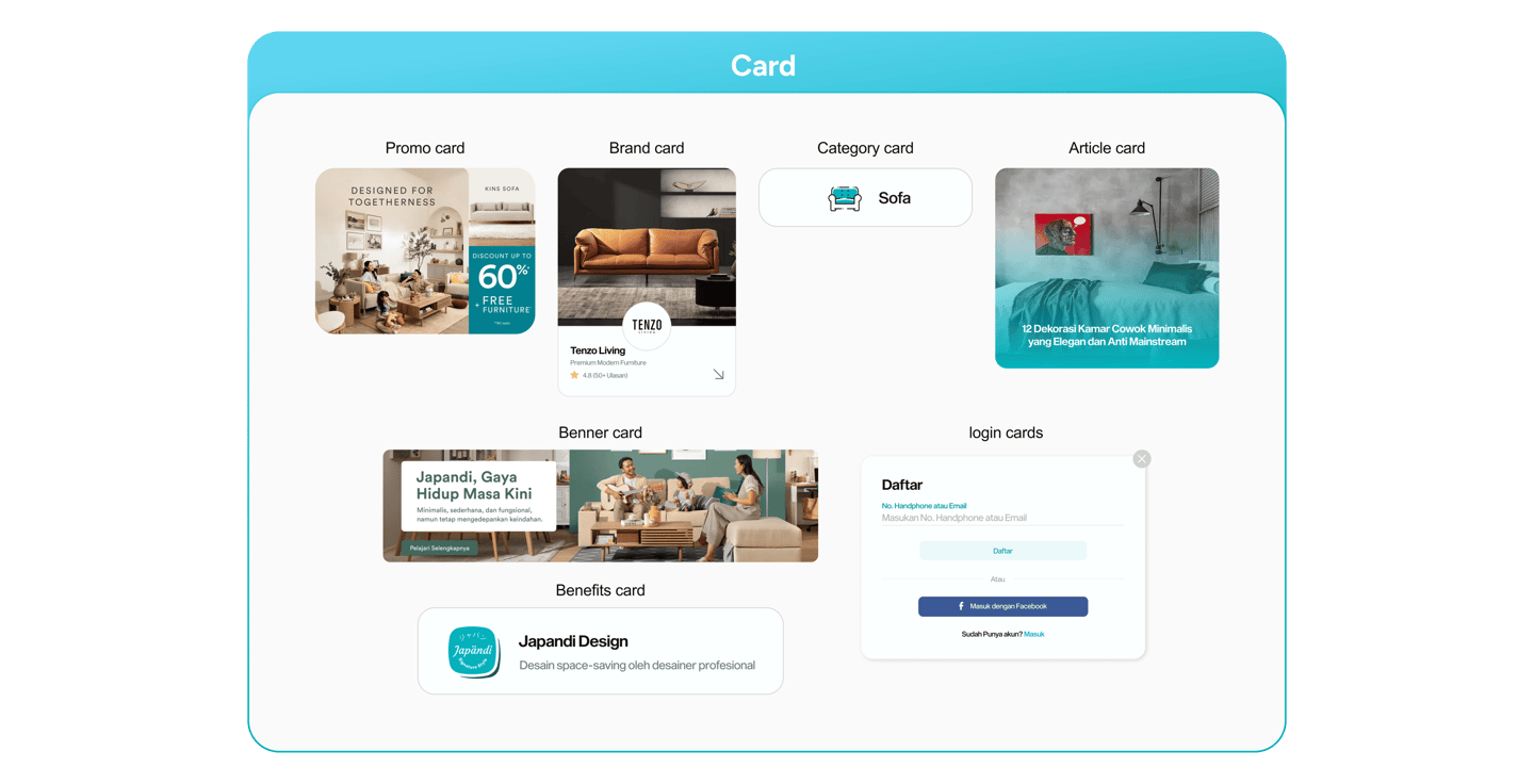
I used Atomic Design on the Dekoruma website to create reusable components that build a consistent and user-friendly interface with built-in accessibility.






Low Fidelity
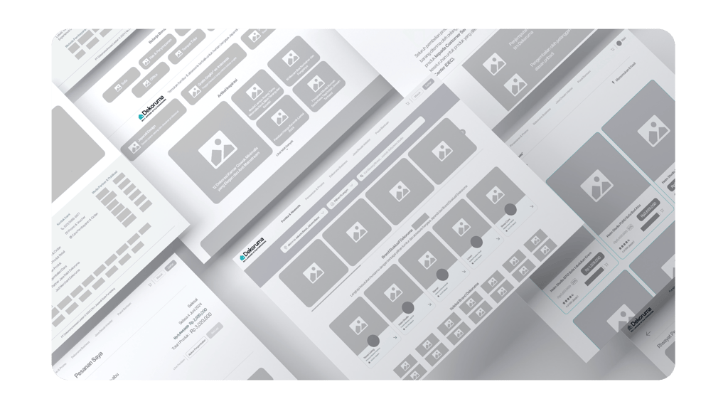
I developed a low-fidelity prototype to prioritize essential functionality and enhance user experience, ensuring we stay focused on the big picture without getting bogged down by finer details.
Mentoring Design
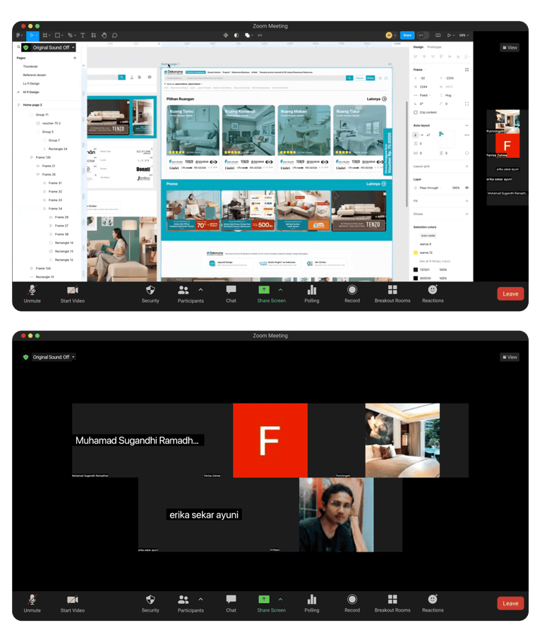
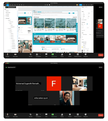
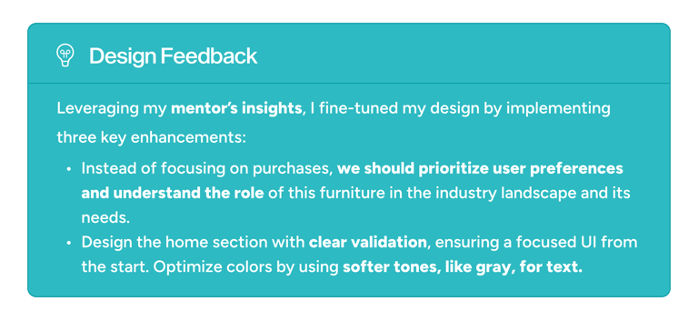
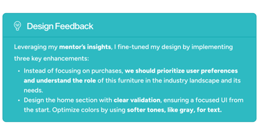
During the design journey, I actively collaborated with Bootcamp mentors through consultation sessions, leveraging their insights to refine and elevate the UI/UX design. This approach ensured that the design not only met high standards but also integrated valuable feedback along the way.
High Fidelity
Based on feedback from my mentor, I developed a high-fidelity design for Dekoruma's website that perfectly matches the aesthetics and user experience.
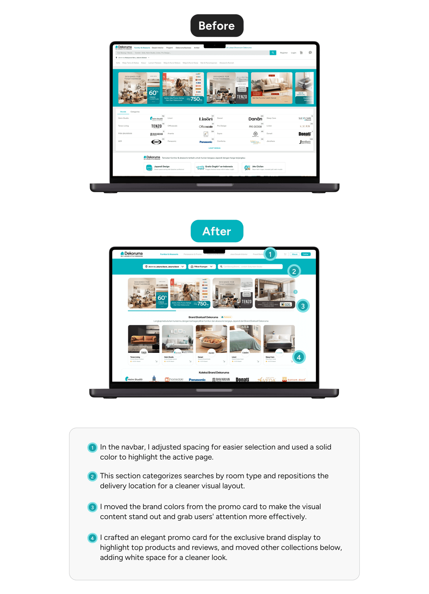
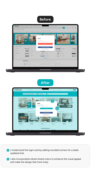
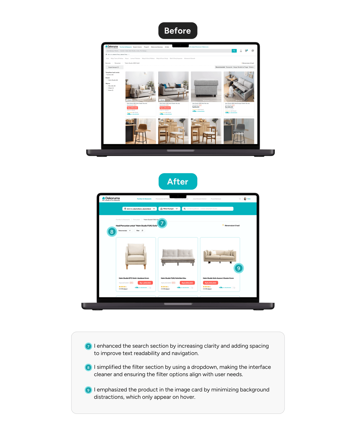
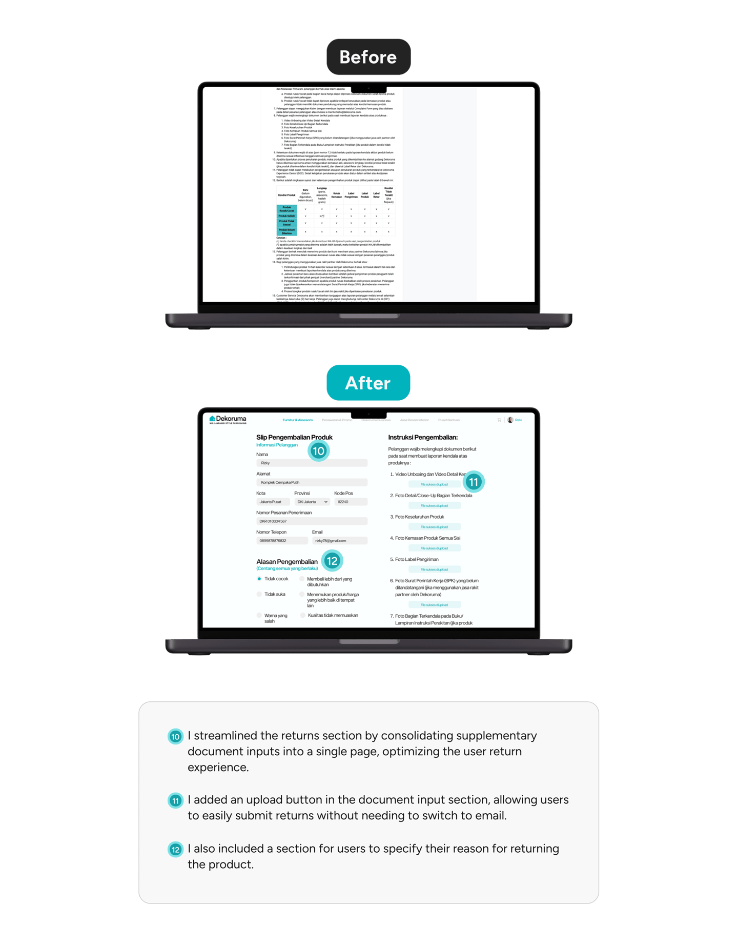
Design Comparison
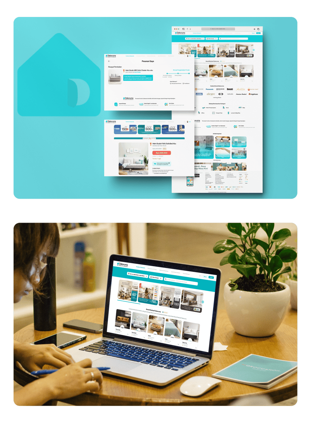
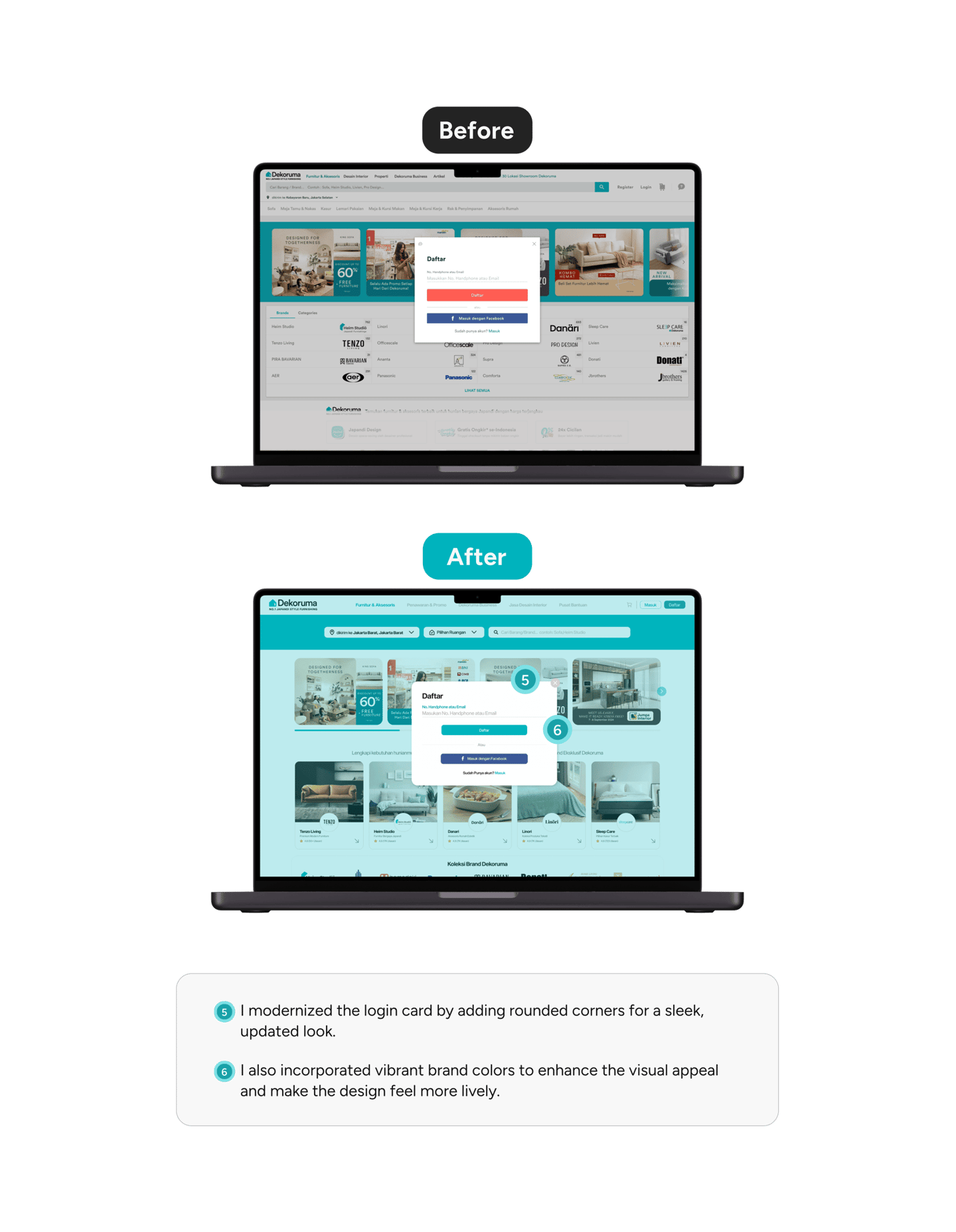
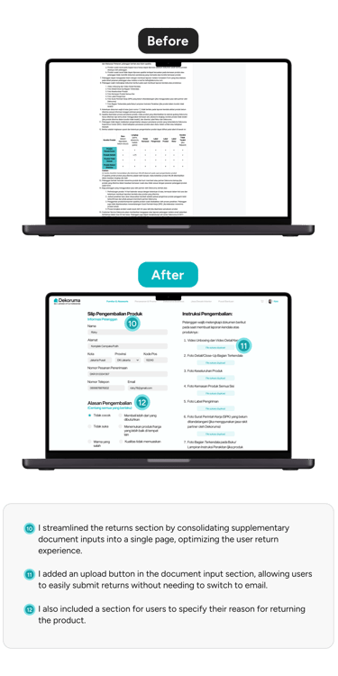
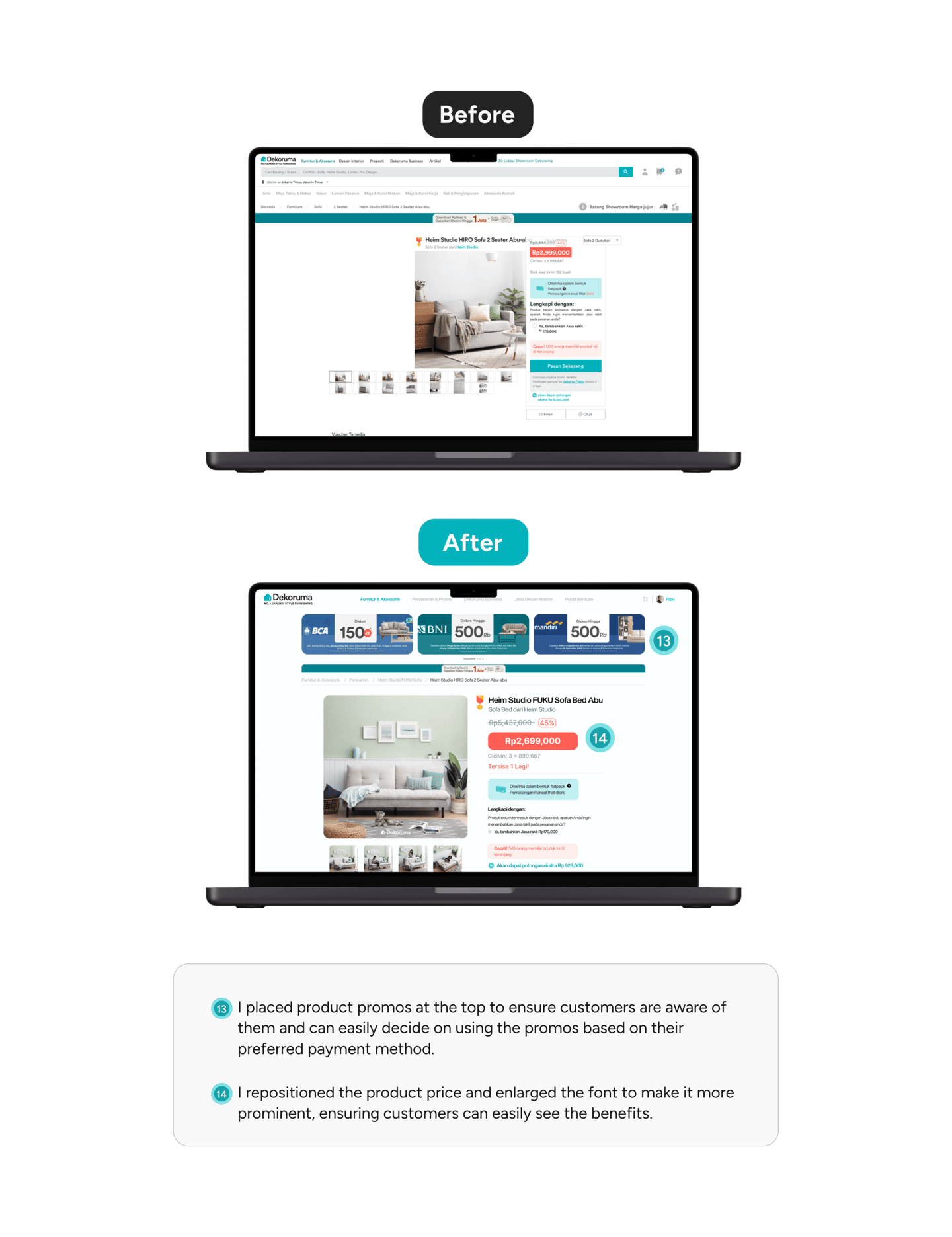
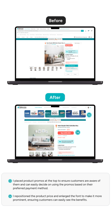
After finalizing the high-fidelity design, I conducted a comparative analysis of Dekoruma’s website UI, highlighting the improvements made.
Usability Testing 2
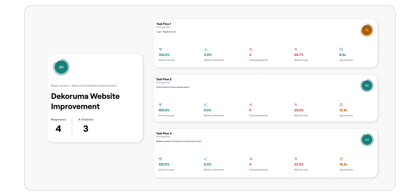
Using Maze, I ran a second usability test to uncover key insights and address issues with the user flow from login/regist account, order product and reedem product through.
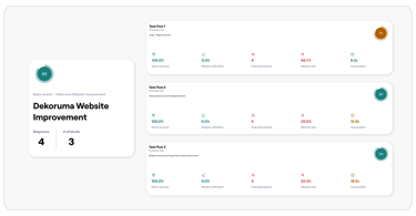
Screen to check
Here’s an interaction heatmap from the Maze Report feature, highlighting user behavior and engagement patterns.
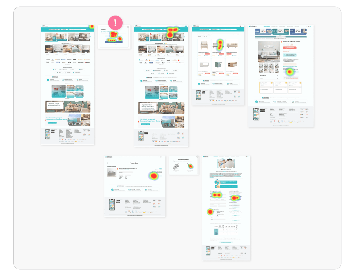
After reviewing the Maze Report heatmap, the CTA buttons performed well, but there was one card that showed a high misclick rate, indicating the need for minor adjustments to improve usability.
Reviewer Feedback
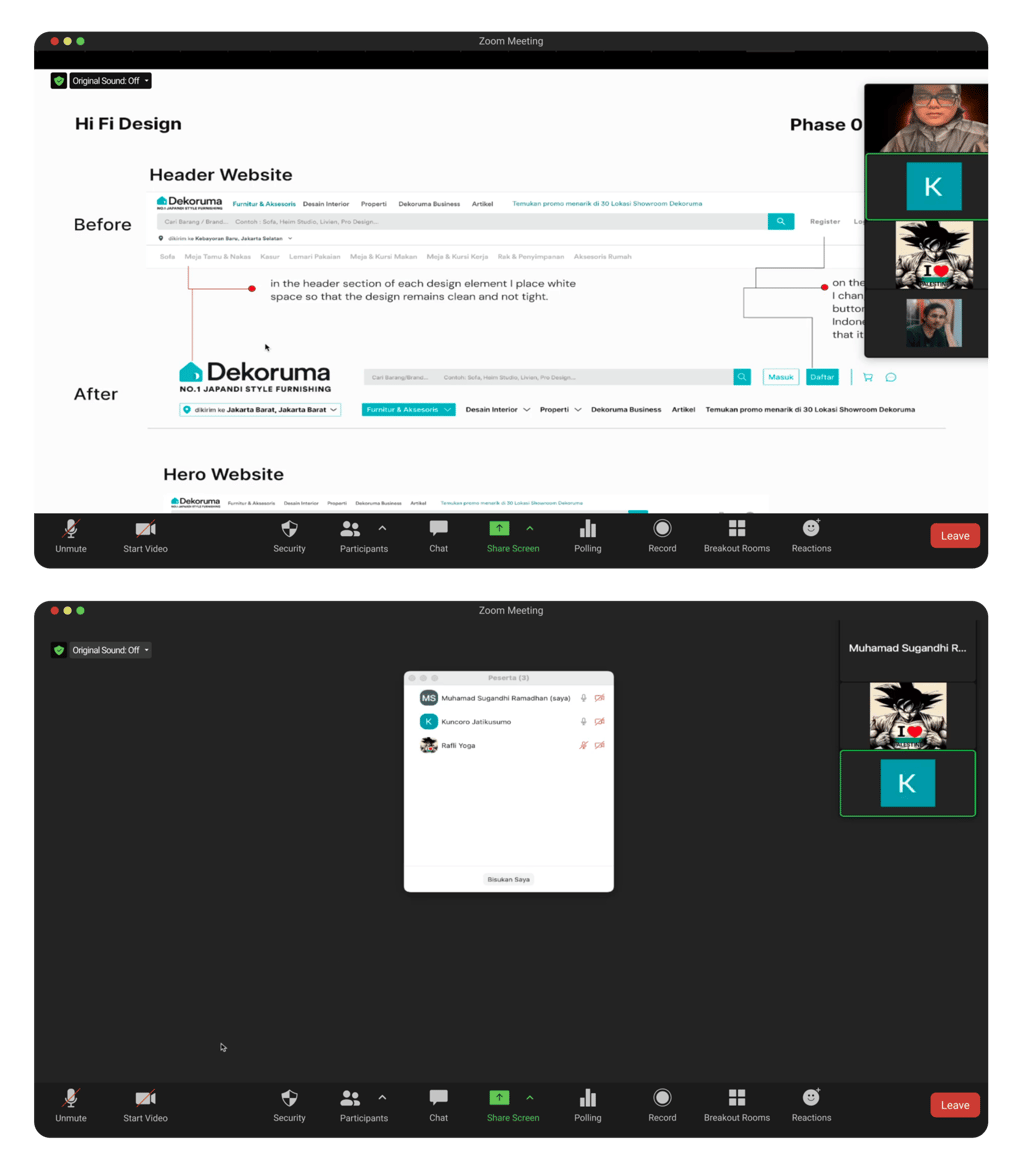
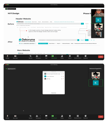
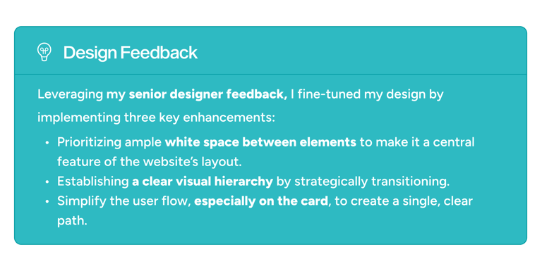
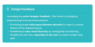
After two weeks of redesign and testing, the revamped project was presented to the senior designer to confirm it meets standards and provides a great user experience.

Prototype
Here is the updated prototype, with improvements to the login/registration process, return flow, and putting products in the cart.
Task Flow 1
Login / Regist Account

Task Flow 2
Order products via the website search

Task Flow 3
Order products via the website Redeem products through the furniture return form

Outcomes
Both initiatives were implemented over two weeks during Usability Testing 1 and 2, leading to these key outcomes:

Final Takeaways
By diving into this project, I navigated challenges like user biases and understanding business operations. Despite these hurdles, I was able to leverage insights to strategically enhance the design, ensuring a more intuitive and user-friendly experience that aligns with both user needs and business goals.
